Art & Design Journals

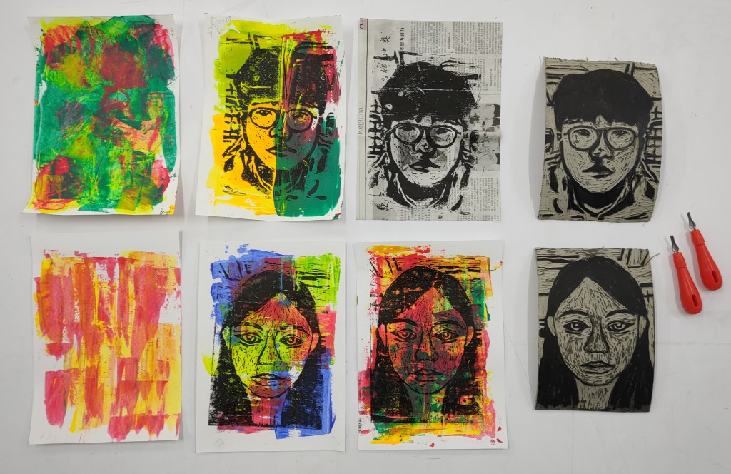
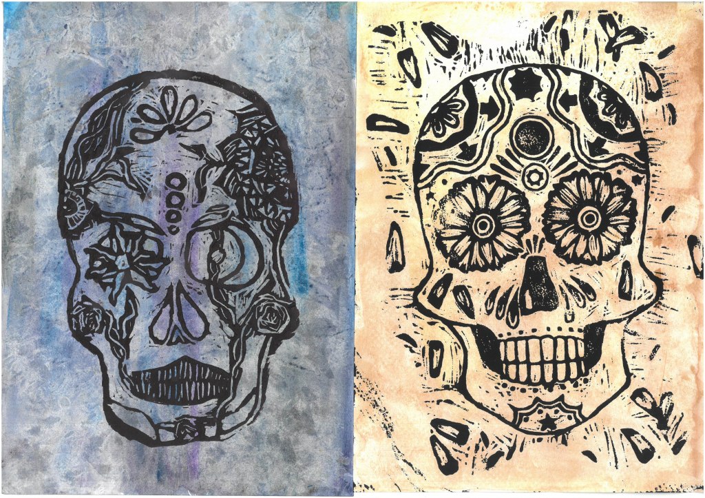
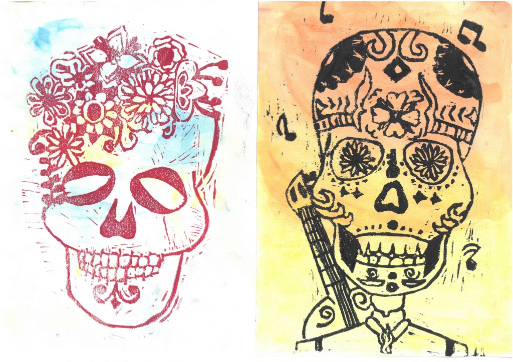
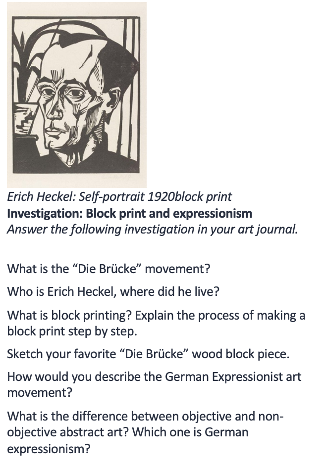
Below are pdfs of design and art journals from years 7-9.

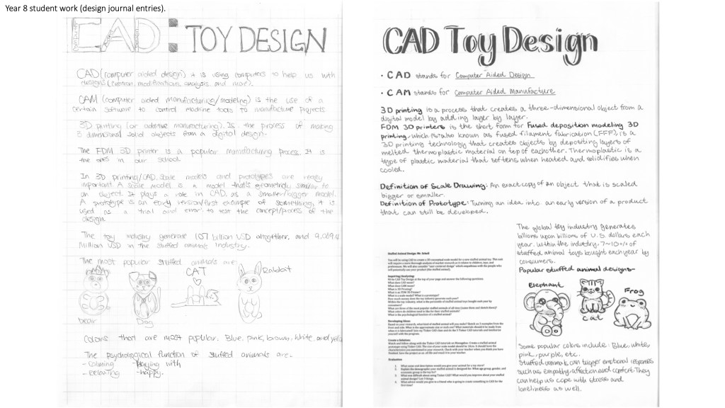
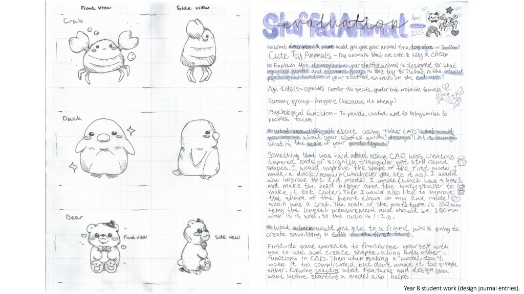
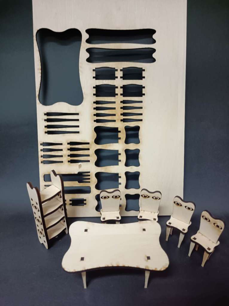
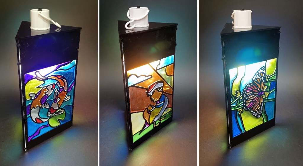
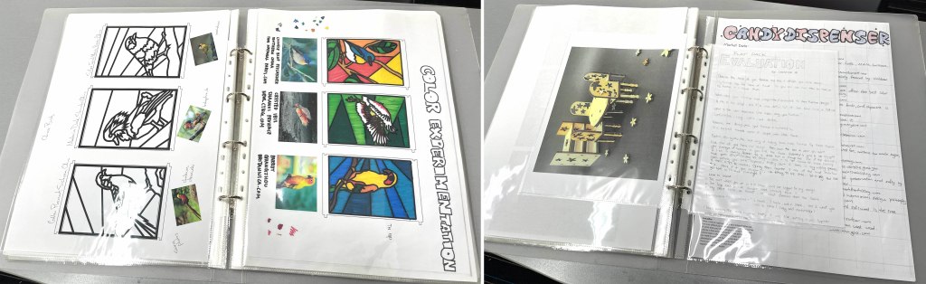
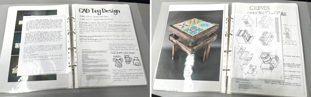
I’ve been working with journals for a number of years. They replaced sketchbooks in an art class, and obviously I’m doing design journals in my current design classes. I’ve really fallen in love with them as an educational tool and want to write about all the benefits I see in using journals. My journals are simple A3 (double letter) size binders with plastic sleeves (so they can take both A3 and A4 [letter size] pages. Here is what they look like. The picture below shows a pages from a children’s cereal box design, and the end of a CAD unit.

Six benefits I see in using journals:

Waste and organization: The initial move was made one day when I was tossing a bunch of half complete sketchbooks in the bin. At my school, every year students started with a new sketchbook and never quite got it done. I don’t have a romantic connection to sketchbooks, so I wondered if binders would be better. Plus, they offer the chance of moving pages around, so they were more flexible if I student missed class or was unorganized. So the following year I switched to binders and have never looked back. To me, the benefits far outweigh any justification to using sketchbooks. I think in most cases, there are art teachers who have an emotional connection to sketchbook.

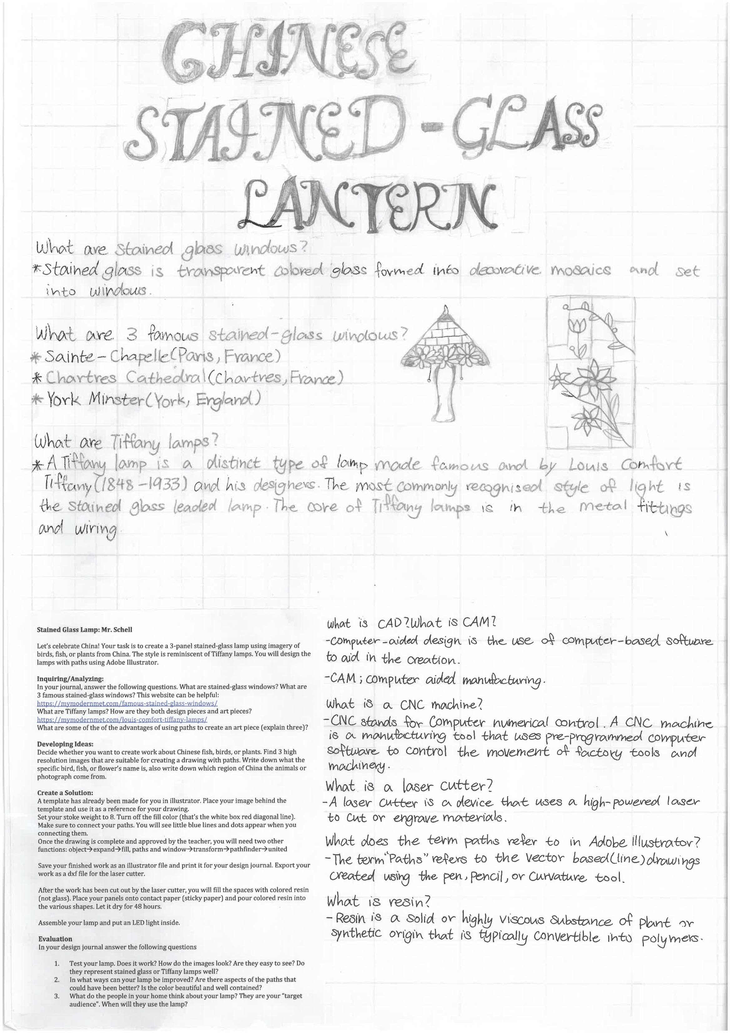
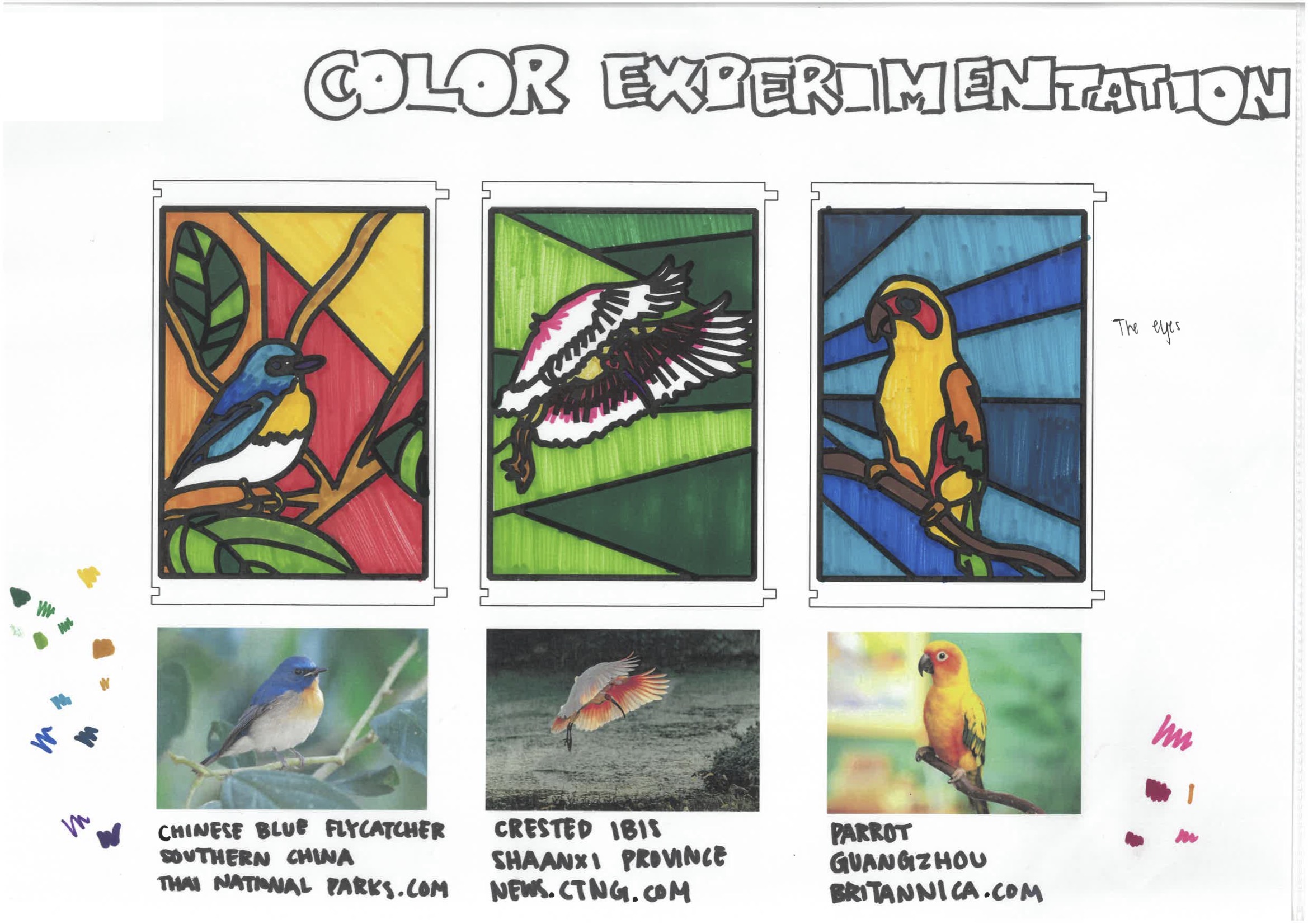
Sequencing lessons (MYP creative/design cycles): Journals also became a great way to make sure that I was sequencing my lessons correctly. I try to follow the MYP cycle, so units start with an inquiry/analysis or investigation, go through a developing ideas and skills phase, the result in a project, and finish with an evaluation or reflection. The second stage, where students are doing a lot of planning, practice, and skill building can get messy. Keeping work sequenced and presentable in a journal helped to showcase the learning better.

The benefits of handwriting: I have almost all tasks in my journals completed with handwriting. As technology pushes education forward, I think it’s really important to remind ourselves of all the benefits of handwriting, such as: improved memory retention and active engagement, enhanced comprehension that includes deeper processing and critical thinking, development of fine motor skills, improved focus, better thought organization, individual expression and artistic development, and even emotional benefits like stress relief and a sense of accomplishment. There are plenty of projects I give that use technology, but we’re still going to do the ground work with our hands in my classes!

Grading is easier: the journals not only made grading easier, but they also helped with consistency. I mentioned the MYP cycles. I build rubrics with the general terms of each area and score all of the projects the same way. Students know what to expect and appreciate the consistency. You’ll notice the the rubric as at the front of the journals for reference.

Improved student agency: student agency is a buzz word in education. I found the learning journals offered numerous benefits to students gaining more agency. They included: better defining learning objectives and planning, tracking progress and reflective practices, and a general ownership of learning. (Student agency is the ability of students to take initiative and make choices regarding their own learning, empowering them to set goals, manage their educational experiences, and assume responsibility for their outcomes)

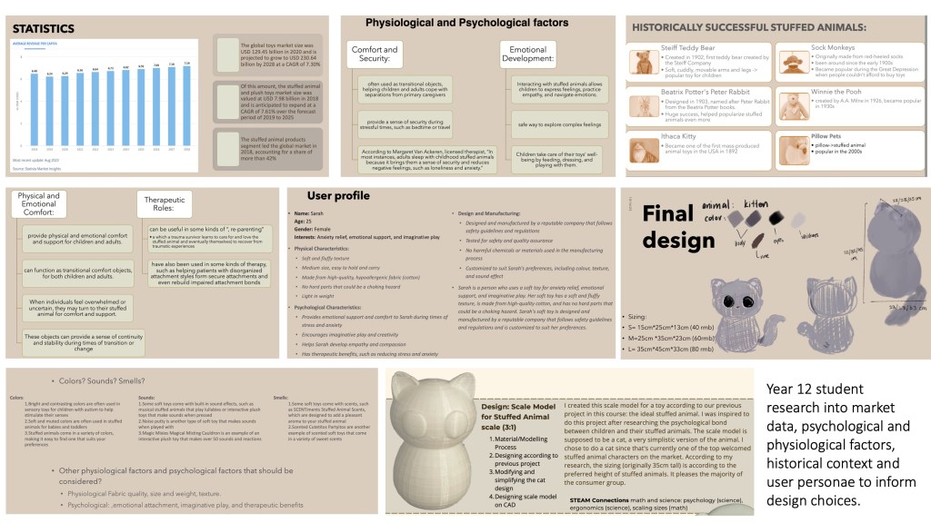
Documenting and tracking student progress: I use journals for years 7, 8, and 9 at my school. First, they’re great for parent meetings. You sit down with the student and their parents and can have a real look at progress over time. I also keep a master journal of student work so there’s a benchmark for what top performing work looks like if the rubrics are not clear. They make really great show pieces of what students are capable of.

There are some drawbacks, however. First, everything has to be A4 or A3 in size. Second, I end up photographing a lot of 3D work and printing it to track things in the journals. It’s fine, but perhaps goes against what I said about waste at the beginning. Last, they’re made of plastic, not paper and cardboard, so there’s the biodegradability aspect. But on the other hand, they preserve the work better too and be reused if students don’t take them.

STEAM

Beautiful things work better!

Perhaps because it reflects real life, but I’ve always been fascinated by the way different subject areas in school overlap. And my two years as a creative technology and design teacher sparked a love for STEAM projects. STEAM, if you are unfamiliar, refers to school assignments that integrate Science, Technology, Engineering, Art, and Math to differing degrees. The key is that it’s all connected. Most of us teachers have been teaching in our subject areas for so long, that we lose track of all the connections, but once you make a few, you begin to see the ways in which your subject area consistently makes connections to other learning areas (and that makes designing STEAM projects much easier).

When I lead workshops on STEAM, I ask my participants to write STEAM vertically on a paper and then brainstorm overlaps in each area. I also ask them to use an AI chatbot for brainstorming. Once you identify the overlaps, it’s easy, they reoccur in different ways. Your framework for teaching also matters. Many (but not all) of the STEAM projects I did were for middle school because I follow a framework based on International Baccalaureate’s MYP design and art cycles. Units start with and inquiry/analysis/investigation and end with an evaluation/reflection, and that’s where I can include questions about science, art, and math, as engineering and technology are almost always prevalent in design projects.

After going to a few STEAM presentations, I set a few rules for myself when designing these projects:

  1. Aesthetics: Does it look good? Does it provide students with sometime to bring home that they’re proud of?
  2. Accessibility: Is this some most schools could do without buying significant new resources?
  3. Practicality: Does it teach students an important life skill or is it completely niche?
  4. Subject area: Does it touch upon all 5 areas of STEAM in some way?

I would also add that it’s important to keep a journal. My students have an A3 (tabloid size) binder where they can keep their research, sketches, and evaluations all in one place. I found this to be more useful than a typical sketchbook or notebook in art as well as design classes. And I insist on handwriting. If you have an AI platform open, ask it about the educational benefits of handwriting. They are numerous, and profound.

I’ll use the example of a project I did this year, a candy dispenser made with a mason jar. It would have been easy to just make it a simple wood shop project, but integrating questions about nutrition, color, and psychology (why do kids love candy and is it addictive?) didn’t require a lot of extra work and transformed the assignment into a STEAM project. The more you integrate these things, the easier it gets and the better you get at doing it. In the candy dispenser unit, I had an evaluation question at the end asking students to figure out how many times they would need to use their candy dispenser to survive for one day. A bit of an absurd question, but it required math and user testing to figure out! First they had to find out the daily calorie intake for someone their age, test how many pieces of candy came out per use on average from their dispenser, research the calorie amount in each serving based on what the candy was (jelly beans, skittles, m&ms, etc.), then divide that amount by the total calorie intake to get their answer. I would have never thought of that at the beginning of my STEAM journey, but now these questions come a lot more naturally.

I’ve attached an adaptation of the presentation I give about STEAM which has 11 project examples. Most of them have already been posted in this blog. Admittedly the slides aren’t that well-arranged (cluttered) as I’ve tried to include lots of resources on each image.

Link to my pdf of my STEAM projects.

Designing Stuffed Animals

Tinker CAD gets a bad rap by designers because it’s often unfairly compared to more legit CAD programs like Fusion 360 (we currently use OnShape for advanced CAD work in my design program). But when used appropriately, Tinker CAD is actually a great way to get used to creating in the digital 3D world and the relationship to things you make and how they actually look when printed as a prototype. Don’t expect it to engineer much, but because the basic toolbar for Tinker CAD is made up of simple geometric shapes, it works really well for designing simple objects like boardgame pieces, furniture designs, tableware, or in this assignment, toys (something most 12–16 year-olds can easily relate to).

I’ve been working on building a catalogue of accessible STEAM projects and this one of them. The connections to art and technology are pretty obvious, but math and science get their nods too when students look at user data like the psychological functions of stuffed animals, the economics of the toy industry and scale models. Students even pitch their designs for a Taobao ad (China’s equivalent Amazon) in a sort of creative writing meets metacognition prompt in their evaluations.

If you’ve never used Tinker CAD before, the first thing you need to know is that it’s free and completely online. It’s pretty intuitive and there are many good tutorials on how to use it on YouTube. I have my students do a two-hour training split up into four 30-minute videos. They keep screenshots of their progress to put in their design journals (evidence that they actually do the work). Afterwards they design 3 stuffed animal prototypes. My design units follow a design cycle based on the MYP framework (inquiry/analysis, develop ideas, create solutions, and evaluate). More on that later when I write more about integrating STEAM into learning.

We don’t actually sew together stuffed animals. You could just consider this a toy for a happy meal or something…but I like the connection to stuffed animals as it provides an opportunity to study the psychological effects of designs on a specific user demographic, the ergonomics/anthropometrics of toys and the concept of scale models. Last year, we printed roughly 100 of the top designs for our STEAM exhibition and gave them away to kindergarten students who got to color them with paint markers under the guidance of our high school art and design students. It was a nice service learning opportunity.

Below are project examples, design journal entries, and the unit outline. I hope it’s useful!

Student projects

Design journal inquiry/analysis (year 8 students)

Design journal (year 8 students) sketches and evaluation page

Year 12 student IB Design Topic 1 (Human Factors and Ergonomics)

Shoot it from Above!

This is one of those assignments that I’m a little embarrassed to share because of its simplicity. But I’ve consistently gotten great results from it, so I’m sharing…albeit blushing a little. I’m also a firm believer that if you have numerous good examples of something, it amplifies student imaginations, giving them more springboards to work from. I’ve included four great photos that can help anyone who wants to do this project with their students.

Classes like AP 2D Design, IGCSE Art, or even IB Visual Art, are often heavily photography based, and these simple tricks can give a lot of punch to a student’s source material (the images they use for art making).

Tell students to take 15 photographs from above (or below), show them the examples, and allow them to tweak the work with Photoshop afterwards. The rest should take care of itself!

Flat-Pack Furniture

Student work: Disney Rococo Furniture

What is flat pack furniture? Flat-pack furniture is a form of furniture that requires customer assembly. The separate components are packed for sale in cartons which also contain assembly instructions and sometimes hardware. In most cases, the furniture is simple to assemble with basic tools, which are also included. There are many advantages to flat-pack furniture from the vendor’s perspective. It is cost effective, easy to transport, easy to store, environmentally friendly, and customizable. It’s popular for great reasons, hence much of the furniture we see today is flat-pack.

Students studied the numerous benefits of flat-pack furniture, including its marketability, sustainable focus, and user-centered (anthropometric) design. Using Adobe Illustrator and a laser cutter, they created tiny scale models of a table set and shelf. Then assembled them, tested their functionality, and took a photograph. We cut the furniture out of 452x304x5mm plywood. I created an illustrator document that size with the male and female pieces as a starting point for each student. It helped to make sure that the holes and connectors fit correctly probably saved us from wasting a ton of wood with trial and error. Students reinforced the joints with glue. I’d like to include fitting it neatly into a box next time I teach it.

At one of our community events, I left unassembled furniture pieces and for children to assemble as a game with these instructions. “Do you like solving puzzles? Assembling a new piece of furniture is a lot like piecing together a puzzle. See if you can assemble some of the mini furniture our year 12 students made looking at the photographs.”

Student Work: Korean Breakfast Set Furniture

Student Work: Butterfly Banquet Furniture

Screenshot of the Starter Board

Unit Outline (I taught this to year 12 students, but wrote a unit for year 9)

Example with the board cut out behind it

Tiffany Style Lanterns

student work, all three sides of the lantern

A shout out to my friend Kristy who started this project with resin-based “stained-glass”. Her previous work was really helpful in developing this unit on Tiffany style lanterns.

Lanterns are a big deal in Asia, they can identify what kind of restaurant you’re walking into or even give a city its identity (like in Hoi An). They also come in varying levels of complexity, ranging from basic paper globes, to massive, exotic animal shapes to celebrate Chinese New Year.

With this in mind, I used lanterns as a catalyst to teach my students about Abode Illustrator, laser cutters, and added cultural elements collaborating with their Chinese teachers, as well as sustainability (rechargeable led bulbs) and ergonomics (safety factors; they won’t shatter like glass and the bulb don’t get hot).

Students first researched famous stained-glass windows and Tiffany lamps. They chose birds, fish, or plants from China as source imagery to give the lanterns an identity. The process was pretty straight forward.

  • Choose 3 images from online (you’ll notice citations in their journal pages).
  • Print the images and trace them with a black marker in the style of stained-glass.
  • Scan those drawings and put them into Illustrator.
  • Copy over the drawing using paths in Illustrator with the stroke set to 8. (I provided the template for the lamp panels)
  • Print the renderings from Illustrator (A3) and do some color studies using markers.
  • Print the 3 panels on acrylic sheets using a laser printer. (our technician did this part)
  • Stick the panels to vinyl contact paper and pour resin into the empty spaces.
  • Let resin sit for 48 hours. (make sure they are perfectly flat)
  • Peel off the contact paper and clean off any left over adhesive with rubbing alcohol.
  • Color both sides of the clear resin stained-glass with permanent markers (use the color studies to guide you)
  • Assemble lantern using super glue or tensile glue (if you use acrylic like me). We printed the triangular tops for our students, but you could have them do it.
  • Place rechargeable LED lights inside and evaluate your work.

Below are examples of the design journal pages showing their inquiry and analysis, developing ideas, and evaluations along with some examples.

inquiry page (A3) and evaluation page (A4) to start and end the project

color experimentation pages with printed Illustrator designs and photo citation

panels with resin poured into the empty spaces

Art Deco Serving Trays: Classic Design

two year 12 student projects

I’ve been working on this wood project related to topic called “Classic Design” that my students have to study for their IB Design and Technology exams. Classic design really got going in the Art Deco and Bauhaus movements. The idea is an age-old argument about form follows function or vice versa…really just thinking about both a lot is the key with this subject. Think of precious objects like the mocha express (invented 1933) that were beautiful conjunctions of what the industrial revolution made possible for designers who wanted to make affordable objects with stay-power…it’s arguably the precursor to sustainability and eco-design because the objects stand up against our contemporary “throw-away culture”. Other great examples things like include the VW Beetle and Levi’s Jeans.

An important aspect of classic design is “retro-styling”. A straight-forward term that refers to making modern objects that reference beautiful designs of the past.

I saw these Art Deco wooden trays made in 1920s France and took them as inspiration for the project. We used chipboard to create a unique texture and added Danish oil, and citrus finishing wax after construction to make the objects: all natural, all biodegradable. I experimented with resin on one of my trays to give the piece more water resistance and didn’t like the results. It also added a lot of extra weight to the tray. I left the option open to my students to finish the board with resin if they wanted. I wanted to students to go full eco-design, but many chose resin. I suppose it doesn’t matter much, as I don’t think these pieces will end up in a landfill because they’ll be cherished by the owner, and that’s the point of classic design.

teacher version | student project

my students made posters for our upcoming STEAM exhibition explaining the process and their design’s connection to other subject areas

numerous trays, you can see the trays with resin have a heavy glare

below are the PowerPoint screens to guide students through the construction

Talavera Tile Tables

Two Talavera tile tables with a few 3D printed scale models for stuffed animal toys.

Many of my friends know that I’ve taken on a new role as head of Design at my school. While I still plan to post plenty of art-related projects, I’m going to post design projects here too…and I just plan to connect them all under the broad framework of things that look good!

This is one of my projects from the first semester. As usual, I try to find ways to get a little more Mexico into my teaching, and this very simple woodworking project, which uses butt joints, glue, and screws also uses Talavera tiles.

What’s been fascinating about teaching design from a pedagogical standpoint, are all of new ways to collaborate, particularly with STEM and STEAM. I immediately saw connections with Spanish class but also things like tessellations in Math. There were other connections to math and science too, like in running tests on the strength of the tables, which were surprisingly strong.

Within Mexico, Talavera is second in popularity only to things like tacos and tequila. But leave Mexico, and a lot of people are unfamiliar with this vibrant ceramic tradition. Originally from a Spanish city called Talavera de la Reina, the artisanal ceramics are mostly produced now around Mexico (especially Puebla and Michoacan). Bold, intricate, bright, and random, they pack a big punch, aesthetically speaking. For those of us working outside the western hemisphere, they offer a unique chance to explore and appreciate the vibrant colors of Latin America. Plus, moms were happy to see these things coming home with their kiddos!

I’m a little nervous about sharing this project because it is laughably simple for serious woodworkers (butt joints, glue, and screws). But as I always say in my talks on art and design: “Beautiful things work better” (Don Norman). I made versions of these tables with varying levels of complexity with my year 8 students as well as year 12s.

The measurements of the table would also change depending on the size and quantity of the tiles. I’ll include the unit outline (based loosely on the MYP design cycle), the PowerPoint screens with the steps, and some exemplar design journal entries by my students. Click on the images to zoom in and see them up close. I also taught isometric drawing in this unit as the students needed to create a technical drawing of their table, a production plan with bill of materials, a professional-looking photo, and a sales pitch as part of the unit.

Design journal entries and unit outline

Isometric drawing practice

Table drawing and bill of materials/production plan

Product photo and evaluation with sales pitch near the end.

PowerPoint screens with a basic overview of construction.

Quilt Vases: Printing Textures onto Clay

Two views of three of the quilt vases.

Slab building is an essential component to any ceramics program. If you’re not familiar with ceramics, slabs are sheets of rolled out clay that are used for sculpting functional and non-functional objects. Many facilities have a slab roller, which is just a large table that rolls out the clay for you…but you can also use rolling pins if you don’t have one.

To spice-up a slab building project, I had students roll their clay onto pieces of lace to print/press the texture onto the clay. The results are shockingly detailed! Every little thread seemed to reveal itself in the networks of intricate patterns. I used the example of quilts to add a cultural/historical component to the project. Most of students had not seen a quilt before and didn’t really know what one was, so that was a great learning opportunity in itself…and that’s how my quilt vases assignment came to be.

The process is pretty simple but requires a basic knowledge of using class, like how to score and slip, dry clay to the leather hard state, and how to stain the textures. I instructed my students to make a vase with at least 10 quilt pieces, most used closer to 15. Cylinders were the easiest, but many chose to make shapes like pentagons, triangles, hearts, or even irregular bottle-type shapes. After their work was fired, we glazed each slab piece with a different color, fired it again, then stained the textures with black and fired then one more time. The staining process was also straight forward. You just brush black glaze onto the surface and then wipe it off the top with a sponge, so the remaining glaze fills the cracks and textures. The pictures above and below show the steps and results.

This was a great art unit to do after printing on linoleum blocks, since pressing the clay onto the fabric was essentially another form of print making.  

Print Making: Mexican and German influences.

La Catrina: Jose Guadalupa Posada 1910 | Erich Heckel: Two Wounded Men 1915

Print Making on Linoleum Blocks: I always think of print making with linoleum blocks as one of those “old school” art teacher projects…like those folks who can’t give up the pottery wheel or dark room photography. But like the aforementioned art forms, there’s so much to learn from it, and some great connections to art history; particularly the beginning of the 1900s.

I always used print making to teach about Jose Guadalupe Posada and his prints related to Mexico’s Day of the Dead, but last year a colleague obsessed with Germany took print making in the direction of German Expressionism and I quickly realized that the timelines overlapped. Guadalupe’s famous Catrina was printed around 1910, while Erich Heckel’s Two Wounded Men was printed in 1915. The connections are fascinating when you think about it. Die Brucke was looking to build a metaphorical bridge bringing expressionism to regular people, and arte popular was doing the exact same thing through print making in new papers. Just think about how much influence Posada’s Day of the Dead imagery and movies like The Cabinet of Dr. Caligari had on guys like Tim Burton or Guillermo del Toro!

Cutting lino blocks is pretty straight forward (just remember to have your students protect their non-cutting hand with a glove!): carve your image, roll your ink, and print. You can draw straight on the linoleum or do a transfer of an image (like a rubbing or using carbon paper). I like having students draw their image on paper, then trace over it with carbon paper underneath to transfer the image to the linoleum block. The art unit starts with an investigation into German Expressionism or Day of the Dead (you can choose!).

We also get pretty eccentric with the papers in my classroom. The German Expressionist prints have silk screen ink squeegeed over cardstock paper as a background. The Posada influenced prints have watercolor backgrounds. It’s a nice activity to do when your students’ hands get tired from carving linoleum. I also like printing on newspaper. The idea is just to see how far your students can take print making and connect it to art history.

German Expressionist Portraits: Silk Screen Ink on Paper, Printed Portraits on Paper and News Paper, Linoleum Blocks, Carving Tools.

Examples of Day of the Dead Projects

Investigation sheets to begin each art unit.