
Bad typography is everywhere. These are two examples. One says La Michoacana (a Mexican ice cream store), the other La Shish. Try reading either one driving by in a car at 30 miles per hour!
I’m not an exceptional designer or typography expert but learning the basics of typography was one of the best things I’ve done as an art teacher. This became important for me when I was teaching AP 2D Design and has helped me in many of my classes since then. I imagine it will make some art teachers uncomfortable, because it’s a bit distant from things like ceramics or painting, but you can learn the basics of Typography by reading up on it over a weekend or two. It’s not that hard to learn the anatomy of letters (x-height, baseline, stroke weight, etc.), the font families (serif, sans serif, display and script), and terminology for spacing (kerning, leading, tracking…). It’s also important to know how to download free fonts as most office programs don’t come with great ones for things like Art Deco, Art Nouveau, or Graffiti (just to name a few). Try a webpage called 1001 free fonts to get started.
I always compare learning typography to taking the red or blue pill in the movie The Matrix. Once you learn it your world changes; you see bad typography everywhere. Your lens for text drastically improves and the world abounds with typographical failures. Mostly this comes down to people forgetting what it’s like to read something for the first time, so they pick a text that looks cool (like a script font) but doesn’t communicate their advertisement effectively. They essentially forget what it’s like to not know what they already know.
For art students, text can become an eye sore. It can literally ruin a great piece of art as a word will immediately become the point of emphasis of that work. Some basic tips I give my art students after learning about typography are:
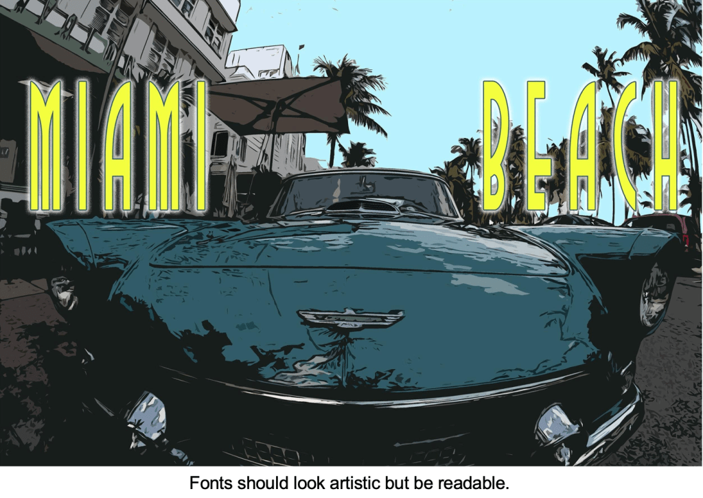
- Fonts should be artistic, but above all, readable.
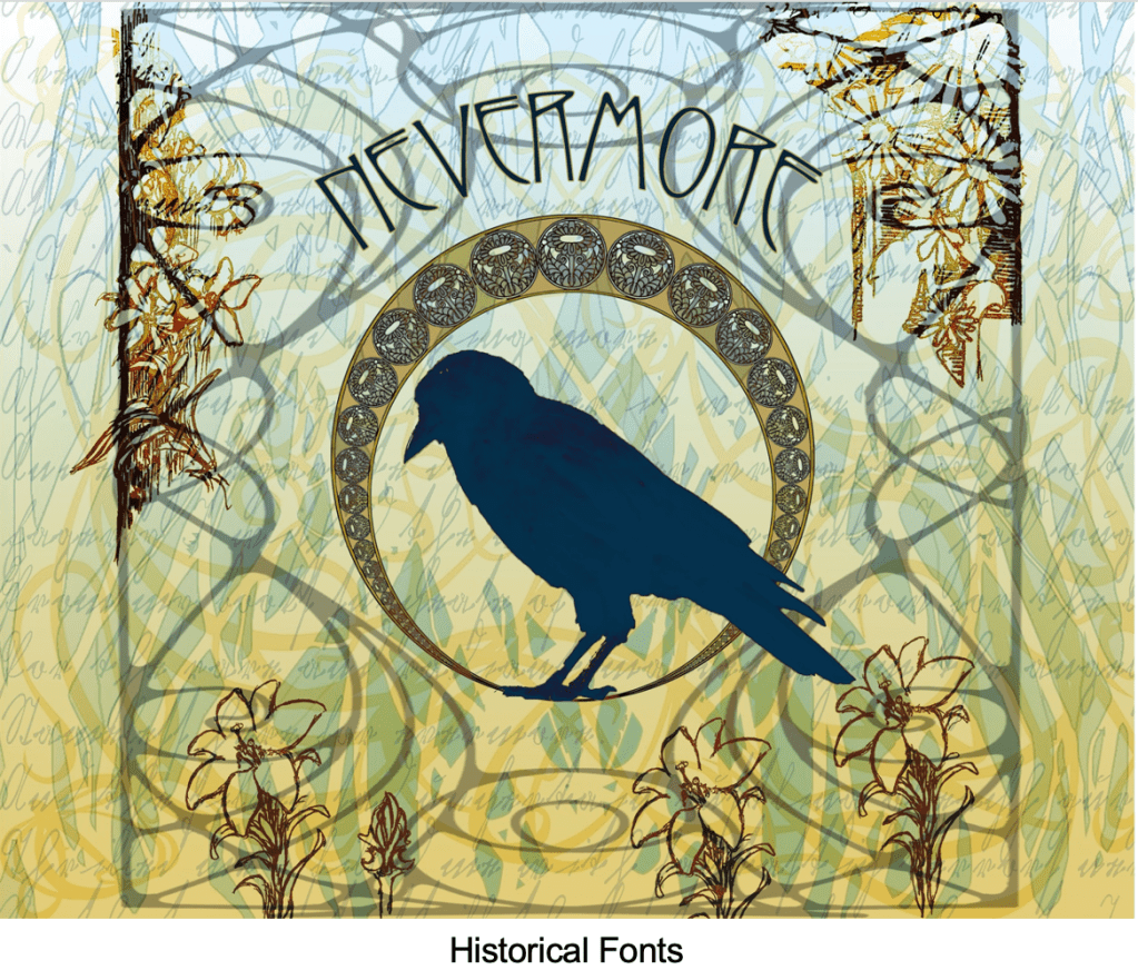
- Consider the historical impact of fonts. Do you need a font from a specific era?
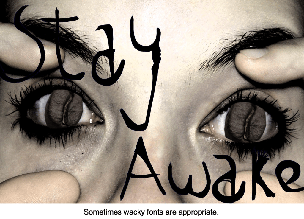
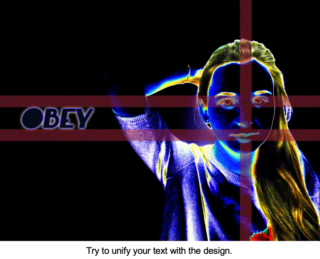
- Sometimes wacky fonts are appropriate, but make sure to unify your text with your art.
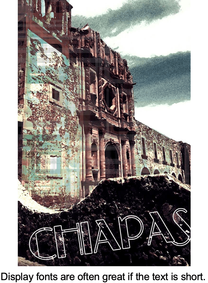
- Display fonts are great if the text is short.
- Avoid over used fonts like Papyrus or Comic Sans.
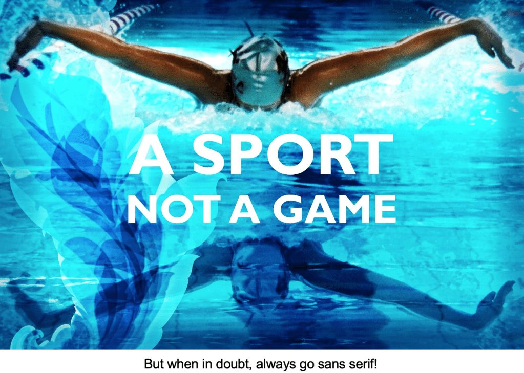
- When in doubt always go sans serif!
Here are some examples of student work.

I routinely learn something valuable from your posts! Thanks
LikeLike