
James Turrell, Mark Rothko, Claude Monet, Henri Matisse….so many of the titans of the art world are who they are because of color. Mike Tyson famously said “everyone has a plan until they get punched in the mouth” and color is what often gives artwork its punch.
So what do you teach students after they know the basics of the color wheel? Students learn primary, secondary, tertiary, and complimentary colors, but what’s next? Here are some of the many things I like to teach my students about color. The list gets into things that students may already see on their phone apps (like Instagram filters) but didn’t have a vocabulary for. If there are other terms that you like to teach your students, please share them with me!
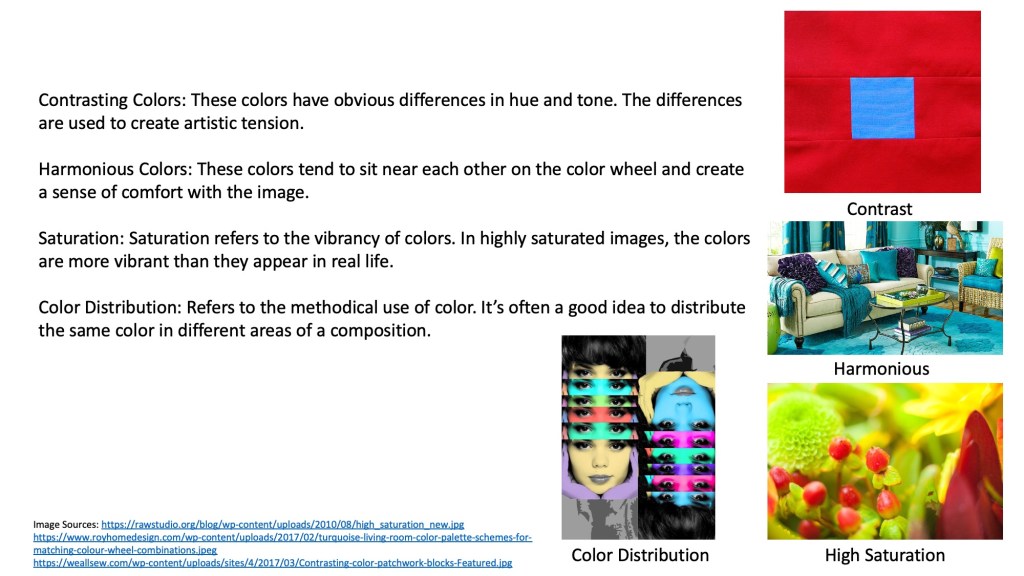
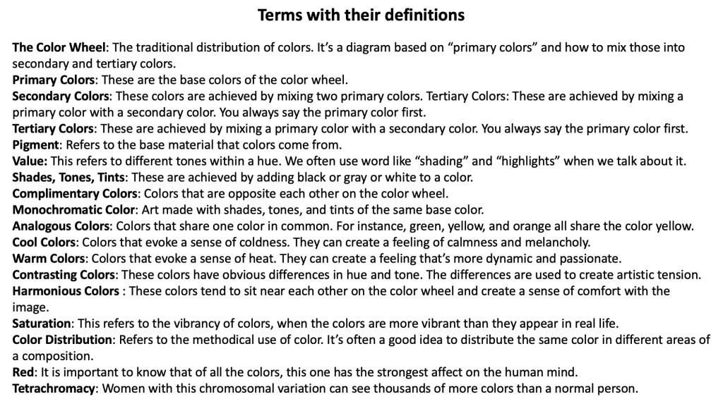
Saturation refers to colors that are more vibrant than they appear in real life.
Muted color refers to colors that are duller than they appear in real life.
Analogous colors are colors that share one color in common.
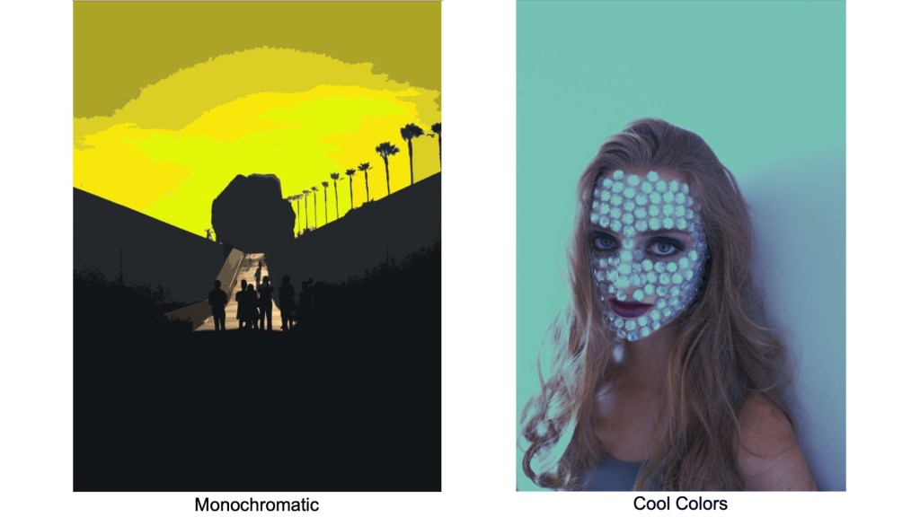
Monochromatic colors refer to different tones of the same color.
Warm and cool color palettes change the emotional response of the viewer.
There are different kinds of black and different kinds of white (usually determined by materials). For example, black compressed charcoal will absorb more light than black oil paint.
The color red warps the mind. It has the strongest effect on us psychologically.
The difference between printed and projected color (RGB vs CMYK).
Color distribution (when you use a color in one are of a piece, consider adding a little bit of the same color somewhere else).
Contrasting colors versus harmonious colors.
And my favorite. Tetrachromacy refers to a chromosomal anomaly in some women allowing them to see thousands of colors that are invisible to the general public.
Below are a few images from my slide show on color including my definitions.

Draw, paint, think, and learn!!! Love your engaging vocabulary presentation!
LikeLike
Thanks Claudia! I try…
LikeLike