Slum Housing Recycled Cardboard Sculpture

This entry is a dedication to one of my colleagues who is moving on this year and led this sculpture project. Emre, you’ll be missed!

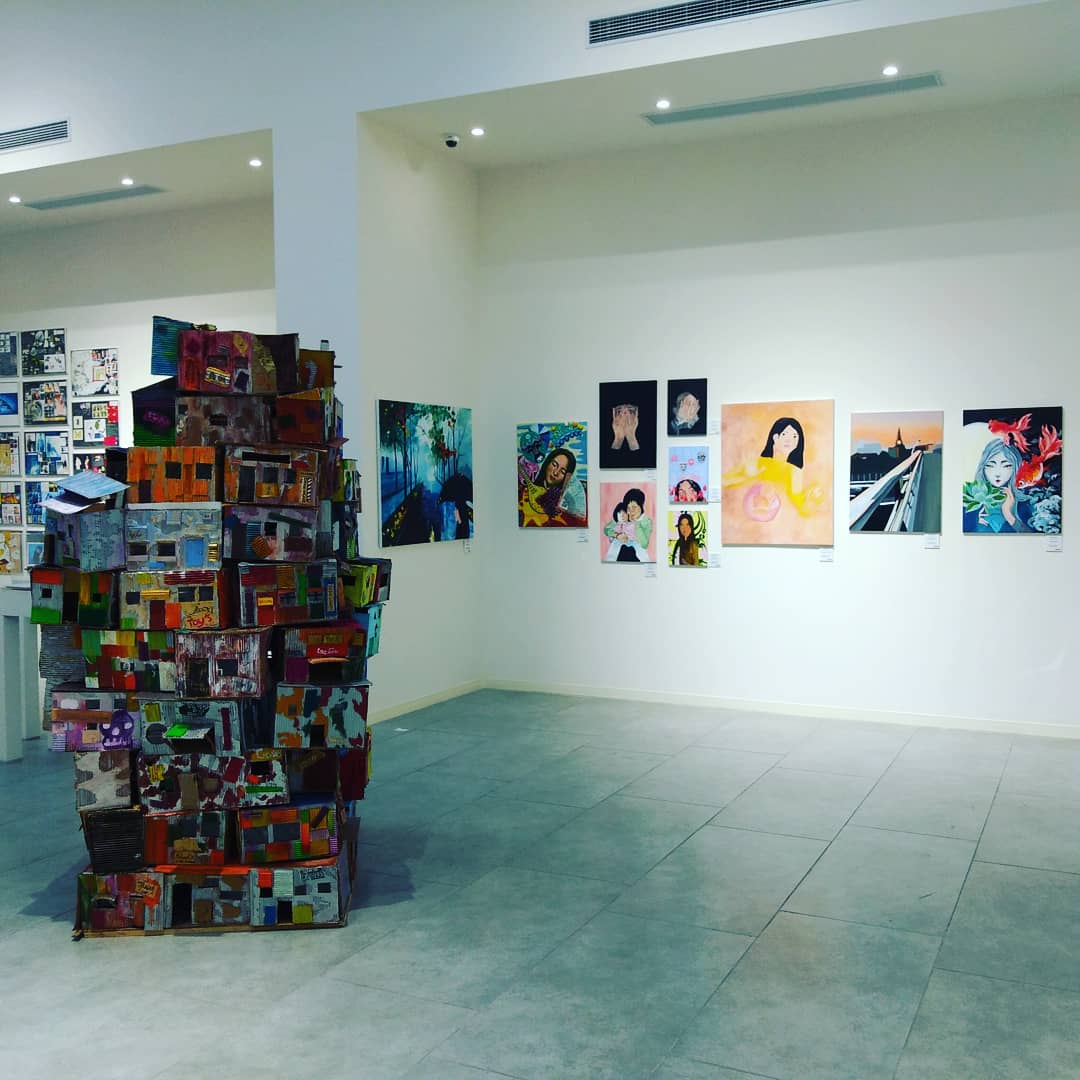
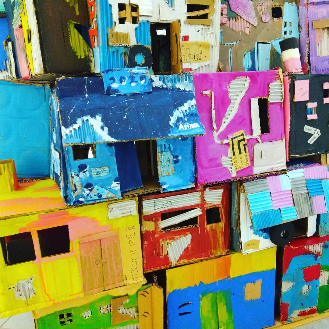
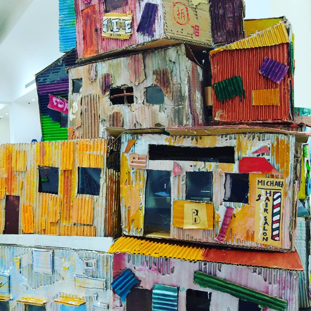
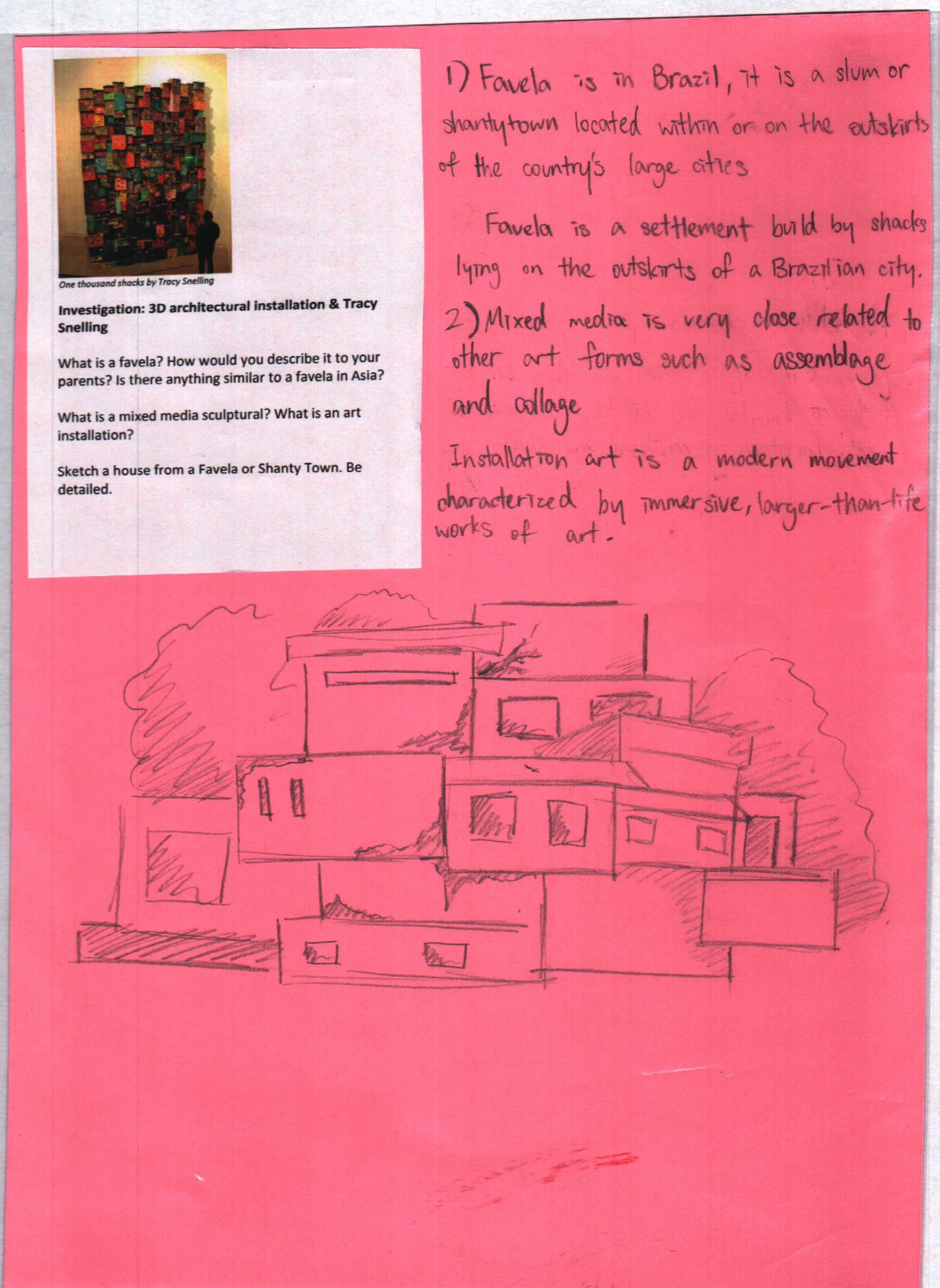
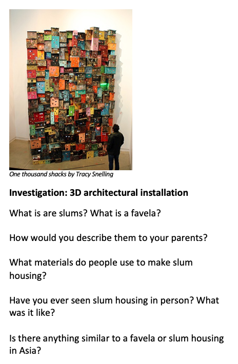
Our slum housing sculpture projects was based on a sculpture called “1000 Shacks” by Tracey Snelling. The materials were very simple: cardboard (preferably used), rulers and box cutters, hot glue guns, and paint. We had this sculpture in a large multi-campus exhibition and it was a big hit! People spent lots of time exploring the intricacies the student work.

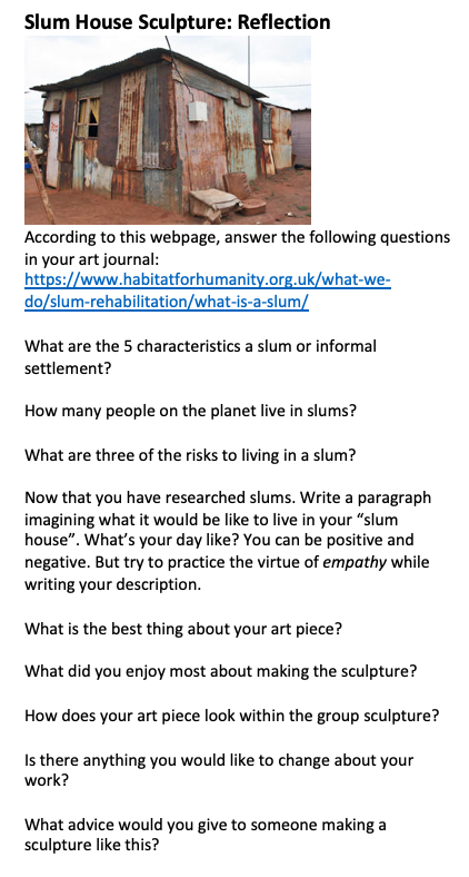
The project also ticks off a lot of boxes. It’s a great collaboration with humanities classes. It’s also great team or group-work project. It teaches how to use recycled materials for art pieces. It can teach empathy and understanding (I designed investigation and reflection sheets aimed at the exploring the causes of slum housing and imagining what it could be like to live in marginalised community). I teach very wealthy students, so this angle worked for my classes. If I were teaching in a poorer neighbourhood, like when I was in north Philadelphia, I would probably change the investigation a little.

The key to this project, sculpturally speaking, is making “L-joints”, which are really simple. You need to cut hundreds of small rectangles out of the cardboard to fold and then glue behind the walls when you make a corner. The houses are 3 sided (we didn’t make a back wall).

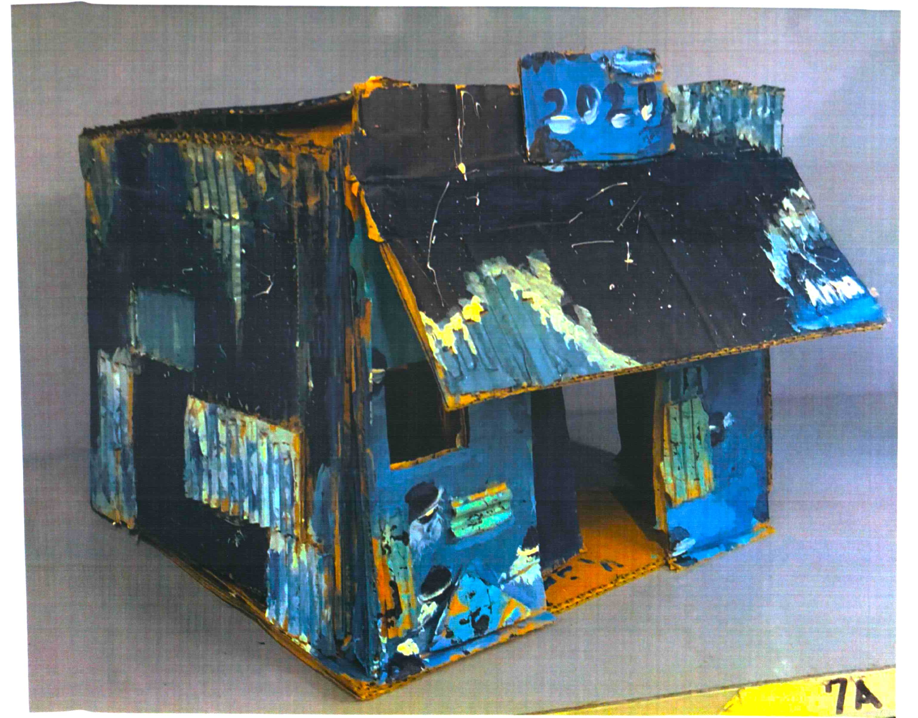
This project was done with year 8 students. You could teach this to older students too, but I wouldn’t go any younger because of the dangerous materials (knives and hot glue). After each slum house was completed, we took a picture to print and put in the student’s art journal. Afterwards the houses were glued together into a giant group, reminiscent of many of the slum houses outside of major Latin American cities. Our sculpture had a simple wooden post behind the sculpture for support.

I’ll attach images of the sculptures and the investigation sheet. As always, I would try making one first before teaching this art unit.

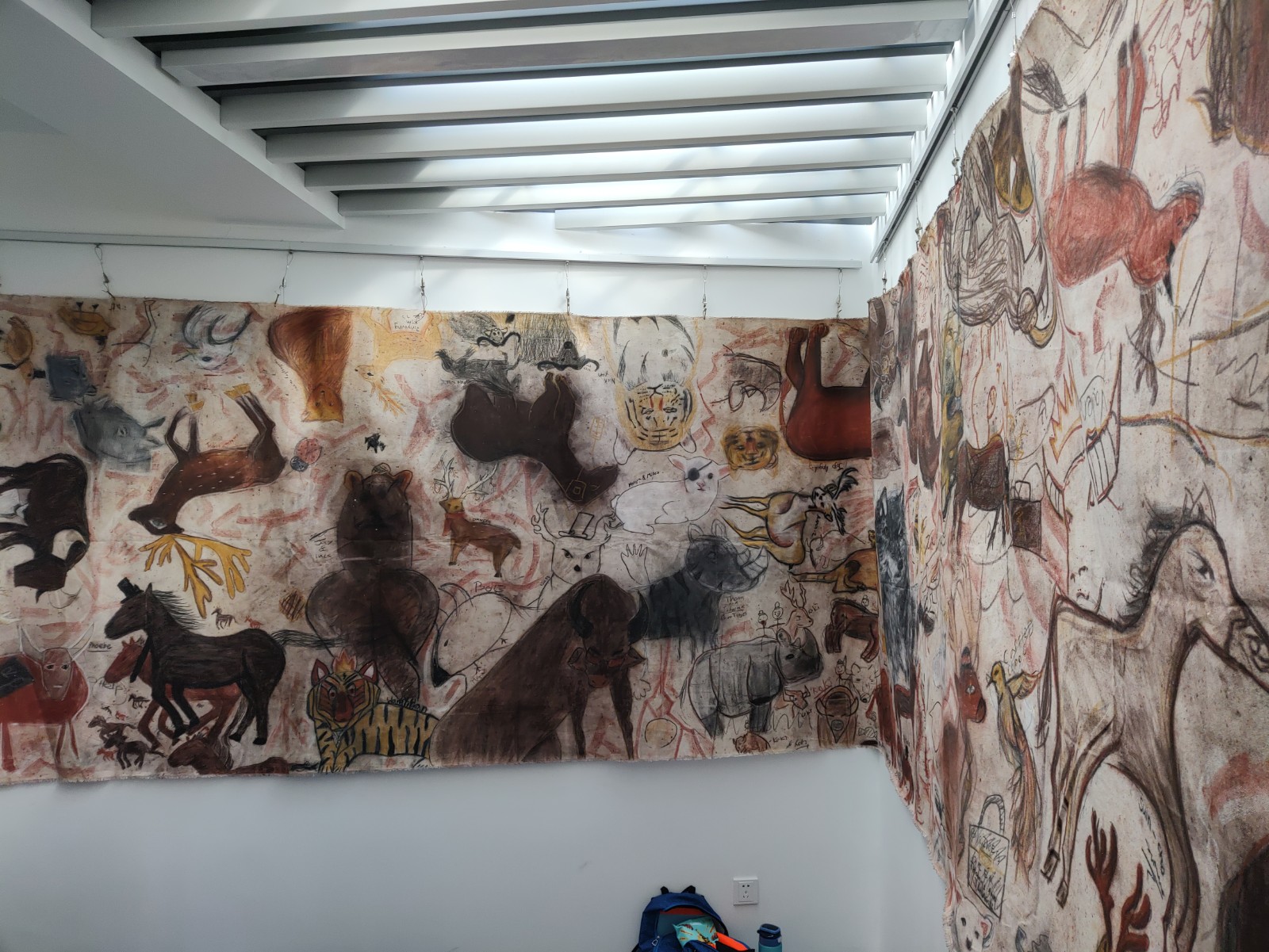
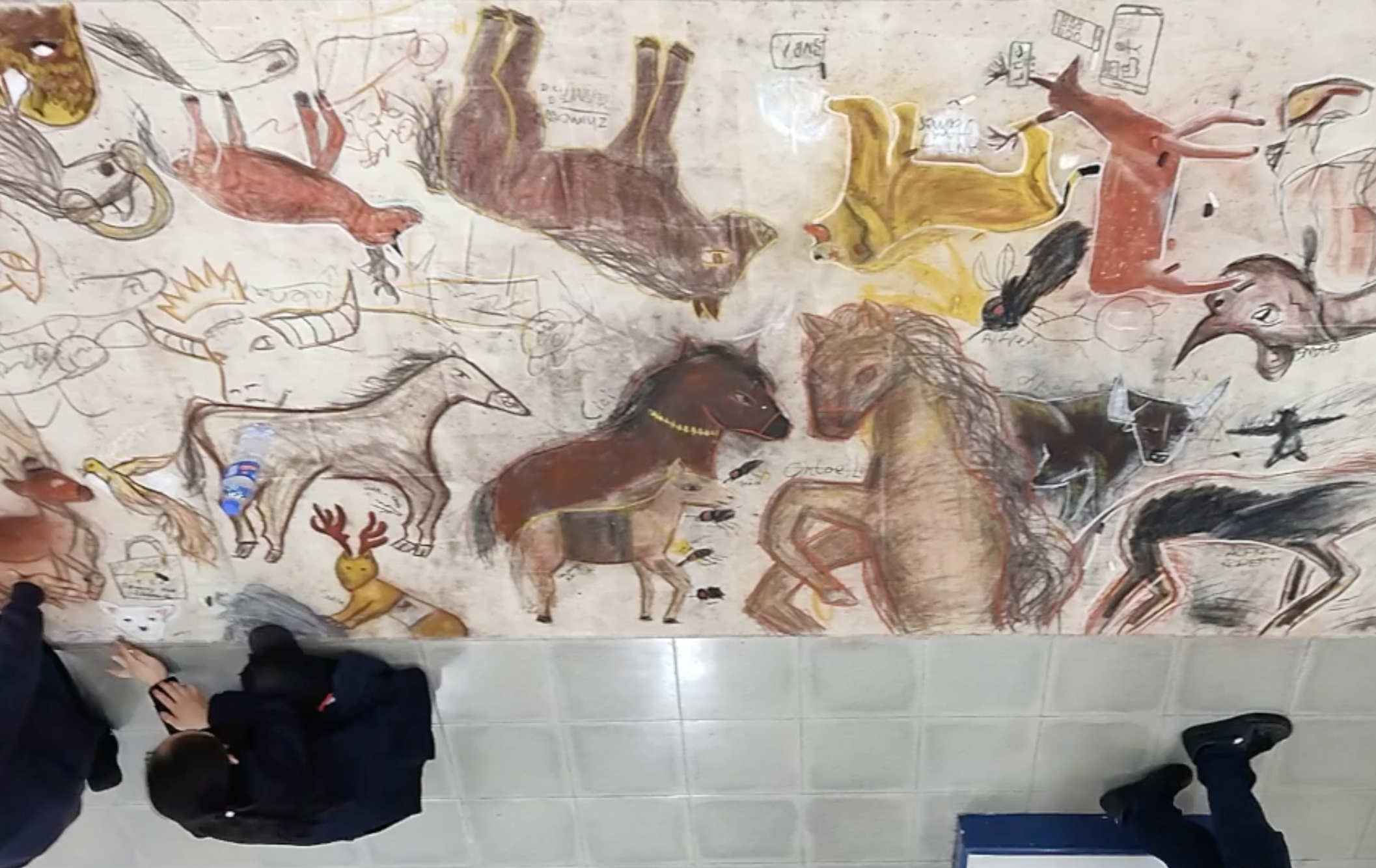
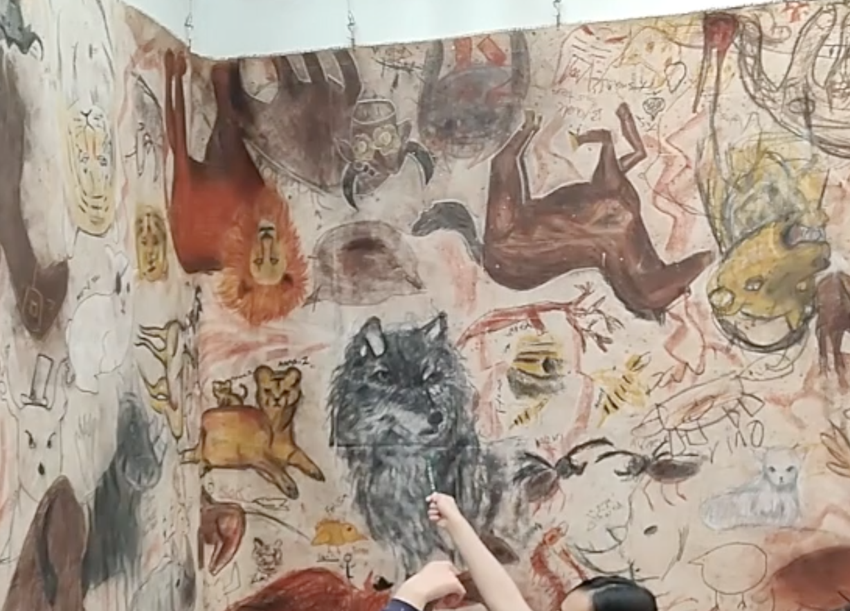
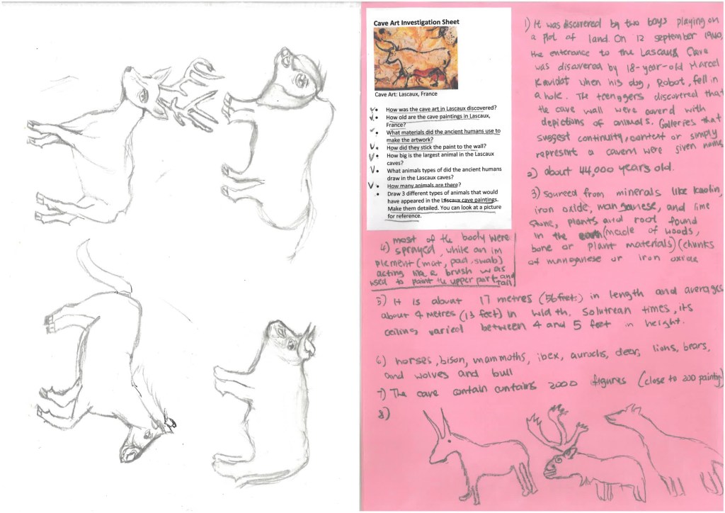
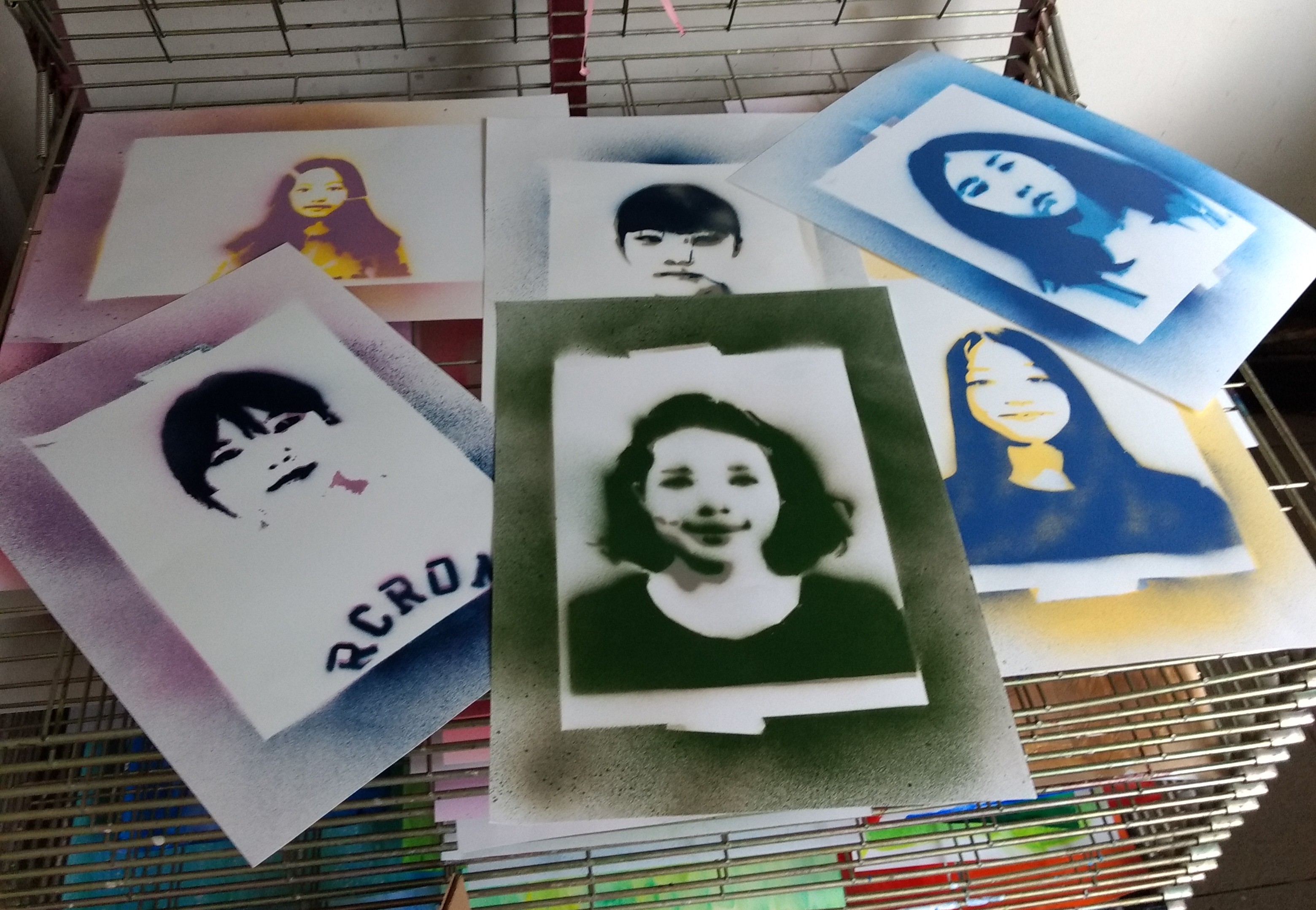
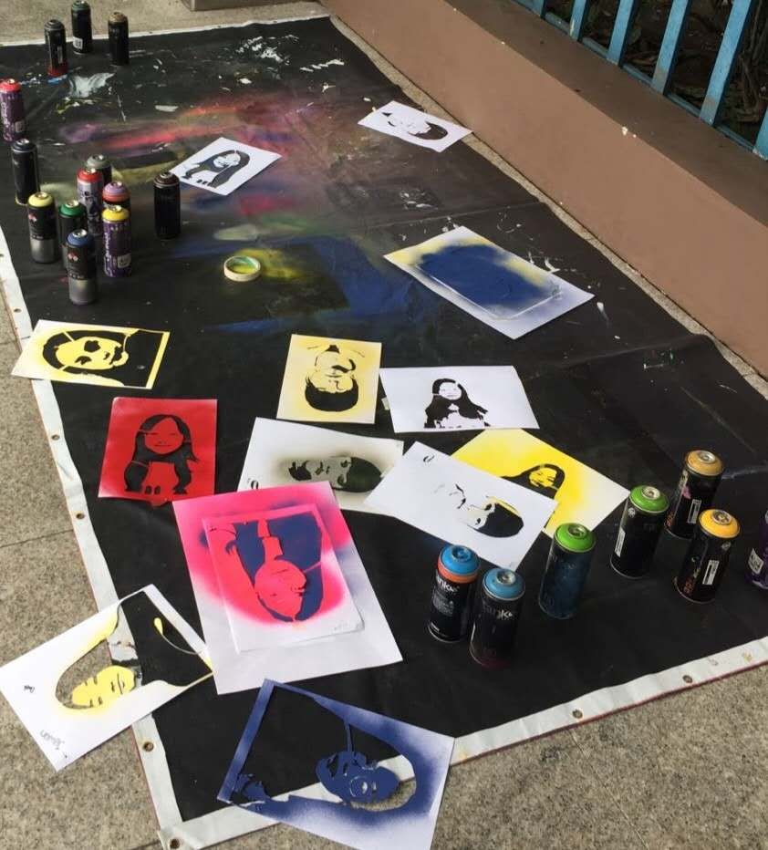
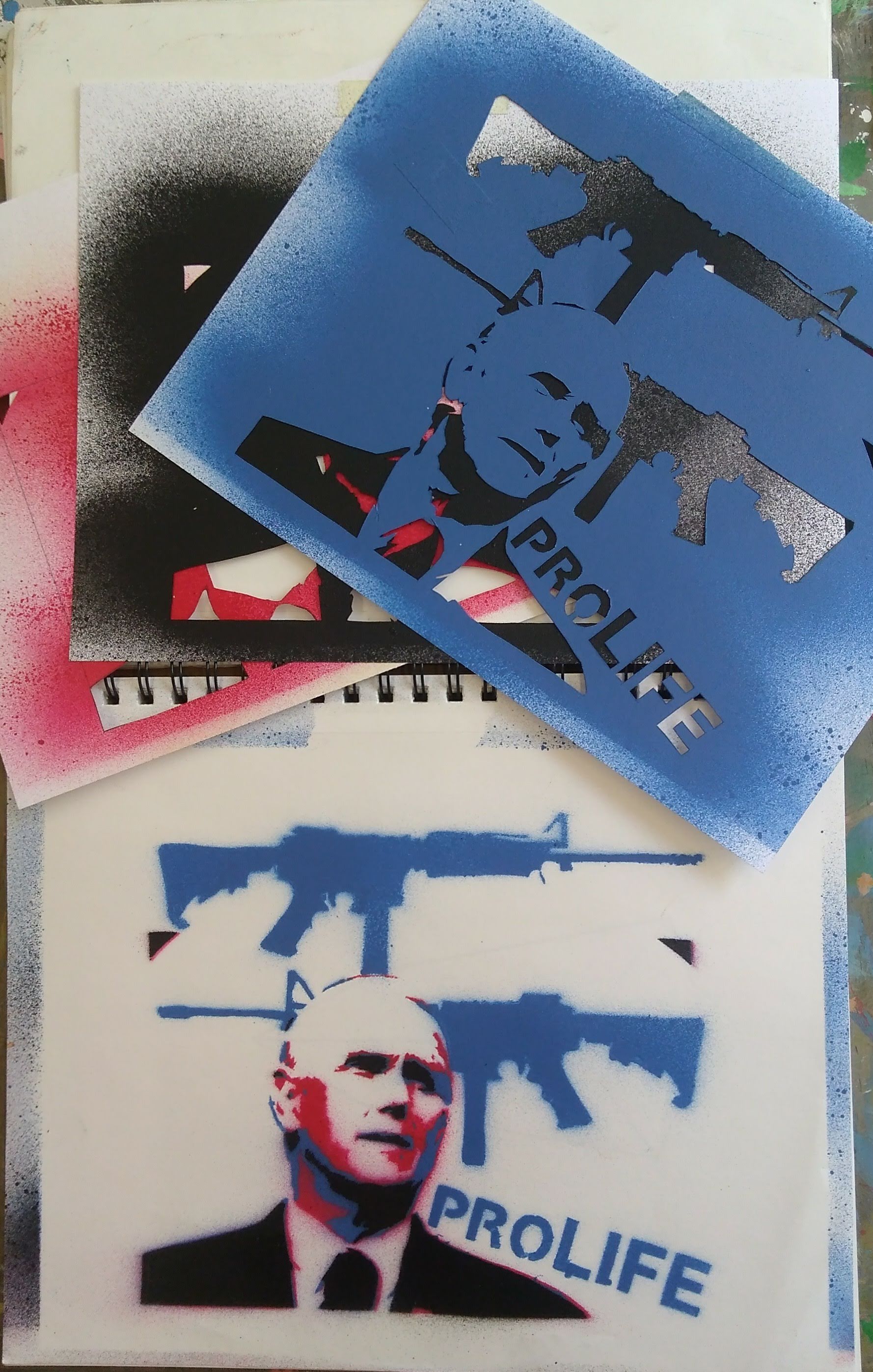
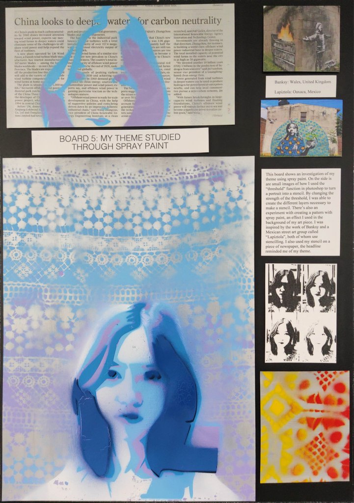
Images: the sculpture at multicampus student show, details of the sculpture, a photo for the student art journal (individual house), investigation sheet from a student art journal, reflection and investigation sheets.

Teaching the Role of Composition in Art

Can you tell it was a hot, sweaty day in Berlin (shirt’s open, long sleeves are off)? I had someone take me a photo next to Vermeer, as I’m a big fan and his art pieces are rare. Vermeer was really into artistic composition.

Artistic composition is a fundamental part of my pedagogy. Perhaps that’s because it was looked over for most my own art education and I had to painstakingly pick it up through intuition and osmosis. Admittedly, that’s what you want though…an informed but intuitive approach to art making. Anyway, I teach my kids about composition and give them a laundry list of rules (or considerations) to memorize. Is it too geeky or nit-noid though? I don’t think so. Even if you don’t make compositionally strong work afterwards, at least you should have a better vocabulary for unpackaging the artwork you see in galleries or museums.

The role of artistic composition is simple. It’s a methodical approach to the picture plane. Things get more complicated after that, however. Most teachers teach the rule or thirds (most cell phones also have it in their cameras); many teach negative space. But how many teach leading lines, breaking the picture plane, points of emphasis, or the Fibonacci Spiral? I’ll leave you with a list of compositional considerations (they’re not really rules) that I teach students. If you have any you would add to the list, please get in touch and tell me! I’ll also include a few screens from my presentation on the subject. If you want my resources on this, get in touch.

I have a presentation pairing compositional considerations with pieces from art history and student examples. The student work is also a great example of using patterns and rhythms.

Compositional Considerations (my list)

Rule of Thirds: Dividing the composition vertically and horizontally into thirds and placing artistic elements on those lines. Triangular Compositions: When art elements are arranged in a triangular formation.

Diagonals and Movement: Diagonal arrangements of a composition imply movement.

Leading Lines: When art elements in a composition imply lines.

Breaking the Picture Plane: This refers to art elements going off the sides of the picture.

Negative Space: Refers to areas which are not the main subject matter and argues that they should also be interesting shapes.

Rhythms: These are similar shapes which change and often imply movement.

Patterns: Duplicated art elements.

Symmetrical Balance: Refers to an equal distribution of “visual weight”. It can give a tranquil or harmonious feeling to art. Asymmetrical Balance: Refers to an uneven distribution of visual weight and can give the feeling of uneasiness or unpredictability.

Framing: Refers to placing a border around an area that the artist would like to emphasize.

Emphasis: Refers to knowing exactly where the artist wants you to look first when you see their work.

Figure Ground Relationship: Refers to the distinct relationship artists negotiate between the subject matter and the background.

Fibonacci Spiral: Invented in the 1200s, this was considered one of the most perfect ways to divide a picture compositionally.

Theme Park Posters

This is one of my favorite intro to Photoshop projects and offers an opportunity to teach all kinds of valuable things like typography (display fonts), layering, and royalty free images/copyright infringement. I have some simple perimeters: pick a city and using at least 6 layers and engaging typography, design a poster for an amusement park, zoo, water park, circus, or aquarium (or combination).

This project comes on the back of an important lesson on artistic composition (which is a different blog post). I also teach how to download fonts for this, which is very easy; just google “free fonts”.

Perhaps the most important part of this project is teaching students about the ethical use of online imagery. Things like not using images with water marks, using search settings on google to look for royalty free images, and just using good judgement and learning how to let go of those images you really want to use but are inconveniently copyrighted. Admittedly, if you worked for a design firm, you’d probably have a subscription to a stock imagery source (like Getty or something). Anyway, I’ve included a PowerPoint slide that I have about that which is helpful, and maybe one day I’ll write a separate blog post about it because academic honesty is important.

Working with layers in Photoshop (or similar programs) is one major key to unlocking their artistic potential. Creating a composition that looks unified is the goal. Some basic tutorials on how to use layers in Photoshop are available on YouTube if you’re unsure. I often do this project with 9th graders so by the time they are taking classes like AP 2D Design in 11th or 12th grade, they’re already pros are Photoshop! Check out some of these great examples!

Student example (9th grade)
This is a screen I made about searching for copyright free images and not using pictures with watermarks. It’s geared more towards painting, but clearly makes the point.

Cave Art

The cave art that is found around southern Europe has always fascinated me. A shocking level of precision, detail, size and difficulty makes one take a second thought about our early ancestors and what life was like 30,000 years ago…for instance, who knew there were rhinoceros in France? Plus it’s one the earliest forms of muralism (another thing I’m passionate about). To make matters more interesting still, some cave art appears to predate homo sapien existence on the Iberian peninsula, which makes me wonder did neanderthals teach us to paint? All of this makes for a great collaborative art project with anything from humanities and science to Spanish or French classes. I use it as a chance to teach students about where the most basic pigments come from, like the iron content in clay or compressed charcoal. It’s also a great chance for students to work collaboratively and change the scale they’re used to rendering things. I do this with middle school students.

Here’s my cave art unit in nutshell (I like the MYP creative cycle for middle school art units, so you’ll notice things start with an investigation, then move on to developing skills and creative thinking, and finish up with a reflection):

Have students investigate the artwork in the caves of Chauvet, Lascaux, and Altamira focusing on when and how they were made. Next they practice drawing the ancient animals which include bovines (bulls/buffalos), deer, horses, lions, and even rhinoceros. A large canvas is rolled out on the floor and students then work on filling it with animals based on their practice using charcoal and conte sticks…modern versions of the ancient materials. I encourage them to add modern accessories…which often gives them a Marc Chagall or Basquiat sort of look. After rolling on a coat of clear paint, the work can be hung in a cave-like space at the school! Finish up with a reflection about the work. The last time I did this, we had great collaborations with a science lab on natural pigments and dyes and reinforcing vocabulary in Spanish class.

Art from Altamira, Lascaux, and Chauvet caves.

Students working on their cave art. The best part of this unit is the team work and making a cave at school!

A student investigation sheet with preliminary sketches.

A student working on a horse drawing.

Unpacking Abstract Painting with Technology

This is a brand new art unit that I started this year and am very excited about. Those who know me, know that I love to teach Photoshop, but love to paint in my personal artistic practice, and this fuses the two! I intentionally take screenshots using Photoshop Elements which is a much cheaper program than Photoshop CS and does many of the same things.

The assignment shows students how to turn a nice photograph into an abstract composition that can later be used as a template for a painting. You could literally print the image on thick paper and then paint right on top of it like it was a coloring book. The primary tools you use in Photoshop are the Hue/Saturation menu and the Cutout Filter. The hue function will change the colors of the photograph and the saturation will make them more vibrant. The Cutout filter is what turns the image abstract. You will want to raise the edge simplicity bar and lower the edge fidelity bar. You could also rotate the image afterwards. The last step is to print it on thick paper and paint on it. You could even change some of the colors in the painting or use different tones. I also recommend outlining the shapes with a charcoal pencil and then using a blending stick to soften the line (which you’ll see in one of the examples below).

The great things about this is it offers lots for students to show about the creative process. Which is a key component of the criteria in IB Process Portfolios or IGCSE Portfolio Boards. Below are two examples from IGCSE portfolio boards (ignore the unrelated artwork). I recommend pairing this with an artist investigation of Wassily Kandinsky. Below that is a student example of a photo from 7Eleven turned into a very beautiful and complicated abstract image.

Stencil Portraits

This is another art unit that uses Photoshop to create some powerful images. In Photoshop, the function to make a stencil is called “threshold” and can be used to make various layers. I like 3-4 layer stencils personally. Any more than that and I get some major burnout from my students getting tired of cutting shapes with exacto knives. There are also numerous websites that will make stencils for free, but learning how to do it with Photoshop will ultimately give you more control. The main thing to know when stencilling are “bridges and islands”. The stencil has to be connected somehow, so no “islands” or little pieces that aren’t connected to the outer stencil. If you do have an island, you must connect it with a bridge. We print our stencils on 60-90lb paper (card stock). You also need to punch a hole in the the corners of all the stencil layers together so they line up after you cut them out and spray them later. Protip: Montana Spray Paint sells a water-based spray paint that is practically odorless and much less harmful (though still wear a mask when spraying!).

Theshold function in Photoshop. Use the bar below to create the different layers. It’s good to start out with a high contrast photo.

If you do this in an IB or IGCSE class a great artist investigation could include one Banksy, who’s work is just fantastic for a study of conflict, peace, and capitalism. But I also like to show a stencilling group from Oaxaca, Mexico called Lapiztola who are great for a study of themes like human migration and indigenous-peoples’ rights ( http://www.instagram.com/lapiztola/ ). I’m a big fan of their work and proudly own one of their pieces.

In the best results I’ve had from this project students paint a base layer of metallic-colored paint (like silver) on a surface, then I have them spray paint through a lace patterned piece of cloth. Afterwards, they spray their stencil on the surface. Once the stencils are made, the best thing is that they can be used over and over again. Spraying them onto a newspaper with an interesting headline is another good option.

IGCSE Board with student work.

Earthworks: Andy Goldsworthy

Back when I taught a 3D art class in the Seattle area, this unit was a staple of the semester. Teams of students would get together and create Goldsworthy-like work around our campus. Fortunately, there were plenty of rocks, leaves, and sticks to do things with. I later realized that this art unit could be converted into a great online learning experience, and that it wasn’t necessary to be outdoors (Shanghai, where I live, is currently in a lockdown). Plus it would get kids off their screens for a little while! The task is simple: make versions of Goldsworthy’s sculptures. The seed (or egg), river (curvy line), spiral (whirlpool), and hole (or circle) could all be made with objects found around the house. Just make sure that you insist your students clean up after themselves!

We watch Rivers and Tides together for the investigation component of the unit and I have them sketch and answer questions like “Andy Goldsworthy is famous and successful, but is his life easy?” and “What rules to you think he follows to make his sculptures?”. I’ll post some examples of student work, both from the Seattle years and more recent online learning.

Laundry Hole, Dog Food Spiral, and Coffee River

The Art Deco Vacation

I’m a big fan of using technology to level the playing field in art class. Many students can think like an artist but may not have the skillset (yet) to draw or paint with precision. This unit hits all sorts of categories that make a great lesson: Art History, Typography, Photography, Composition, Color, Photoshop, to name a few. The result are often great and can be additions to an AP 2D Art Portfolio or an IGCSE A2 Board, not to mention a great Process Portfolio page or two for IB Art.

The basis is simple. Using a great photograph or two from vacation, make a poster in the style of Art Deco. I recommend studying Roger Broders for this project. The photos can be reduced to something simple like Art Deco using a few Photoshop functions: the cutout filter, poster edges filter, and the image saturation (to enhance the color). Students should also download an Art Deco font (free online).

If you live in a city, like I do right now, there is the added bonus that there are probably some Art Deco buildings around for students to see. This is a great reference to how what we learn can improve the quality of our life. I personally enjoy taking note of this aesthetic style while riding my bike around the city and passing Art Deco buildings.

Here are a few examples from AP 2D and IGCSE portfolio boards:

Op Art

Op Art (short for optical illusion art) is something I always like to go to when I have to teach online classes or have a cover teacher. There are a myriad of great instructional videos for this on YouTube and it reinforces foundational elements like line, shape, form and value. Plus it’s great for middle school or high school age students and fits easily into a 1 hour lesson. It gives students who aren’t the most gifted artists more confidence too as they can use a ruler and basic shading for most of the activities.

All of the pieces except for the floating cube are student examples (I’ve done the floating cube many times, but couldn’t find a good picture!). The pieces can be enhances by a camera taking a picture at the better angle and are fun to leave around the house as they really play with your perception when seen in passing or via peripheral vision. There’s a real rabbit hole here…once you start looking up Op Art videos on YouTube you’ll find countless great tutorials.

I think Op Art often gets written off as gimmicky, but it teaches us so much about human perception and the use of patterns. Pattern is one of the most overlooked art elements after all. This can also be a catalyst for really cool things like a “tape art club” that makes Op Art murals for the school.

I have no association with these videos other than that I like them! I’m sure you can find plenty on your own too. Square hole: https://www.youtube.com/watch?v=H1yp5YVdjqo Circular hole: https://www.youtube.com/watch?v=TnVv3hO8vE4 Heart-shaped hole: https://www.youtube.com/watch?v=OUkA4ReI0Ho 3D Sphere/Oval: https://www.youtube.com/watch?v=EWfU5BJSoo4