Teach Typography

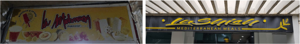
Bad typography is everywhere. These are two examples. One says La Michoacana (a Mexican ice cream store), the other La Shish. Try reading either one driving by in a car at 30 miles per hour!

I’m not an exceptional designer or typography expert but learning the basics of typography was one of the best things I’ve done as an art teacher. This became important for me when I was teaching AP 2D Design and has helped me in many of my classes since then. I imagine it will make some art teachers uncomfortable, because it’s a bit distant from things like ceramics or painting, but you can learn the basics of Typography by reading up on it over a weekend or two. It’s not that hard to learn the anatomy of letters (x-height, baseline, stroke weight, etc.), the font families (serif, sans serif, display and script), and terminology for spacing (kerning, leading, tracking…). It’s also important to know how to download free fonts as most office programs don’t come with great ones for things like Art Deco, Art Nouveau, or Graffiti (just to name a few). Try a webpage called 1001 free fonts to get started.

I always compare learning typography to taking the red or blue pill in the movie The Matrix. Once you learn it your world changes; you see bad typography everywhere. Your lens for text drastically improves and the world abounds with typographical failures. Mostly this comes down to people forgetting what it’s like to read something for the first time, so they pick a text that looks cool (like a script font) but doesn’t communicate their advertisement effectively. They essentially forget what it’s like to not know what they already know.

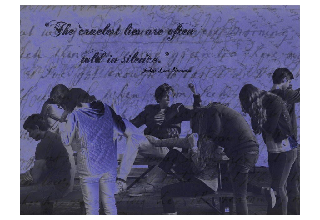
For art students, text can become an eye sore. It can literally ruin a great piece of art as a word will immediately become the point of emphasis of that work. Some basic tips I give my art students after learning about typography are:

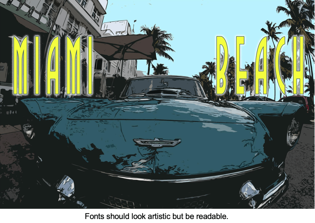
  • Fonts should be artistic, but above all, readable.
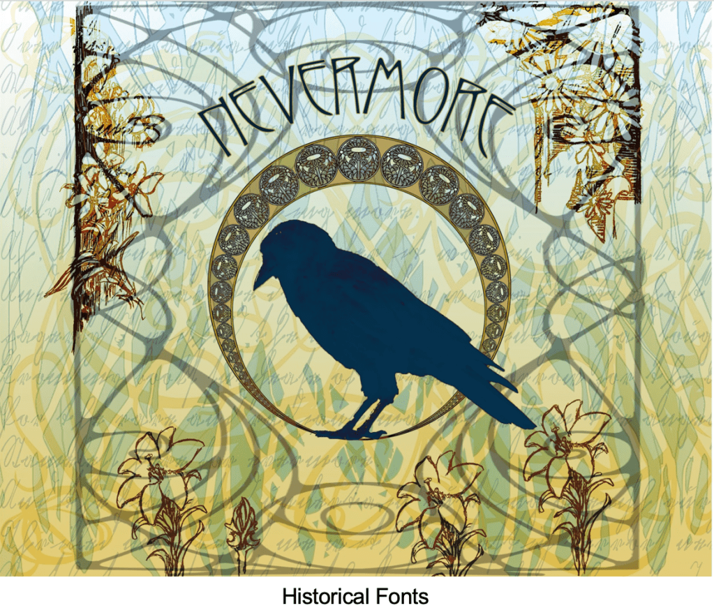
  • Consider the historical impact of fonts. Do you need a font from a specific era?
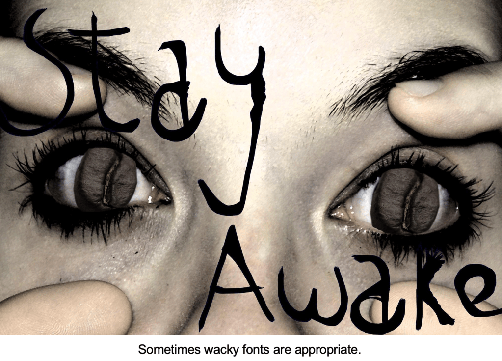
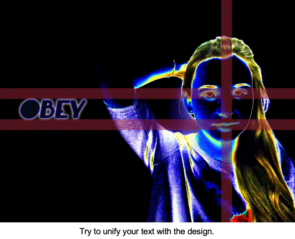
  • Sometimes wacky fonts are appropriate, but make sure to unify your text with your art.
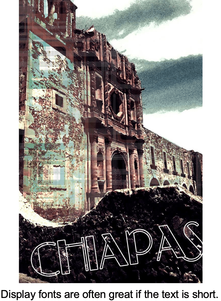
  • Display fonts are great if the text is short.
  • Avoid over used fonts like Papyrus or Comic Sans.
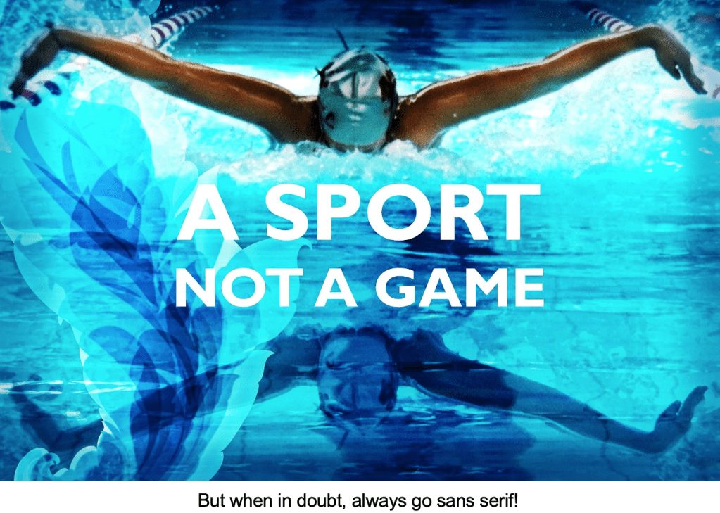
  • When in doubt always go sans serif!

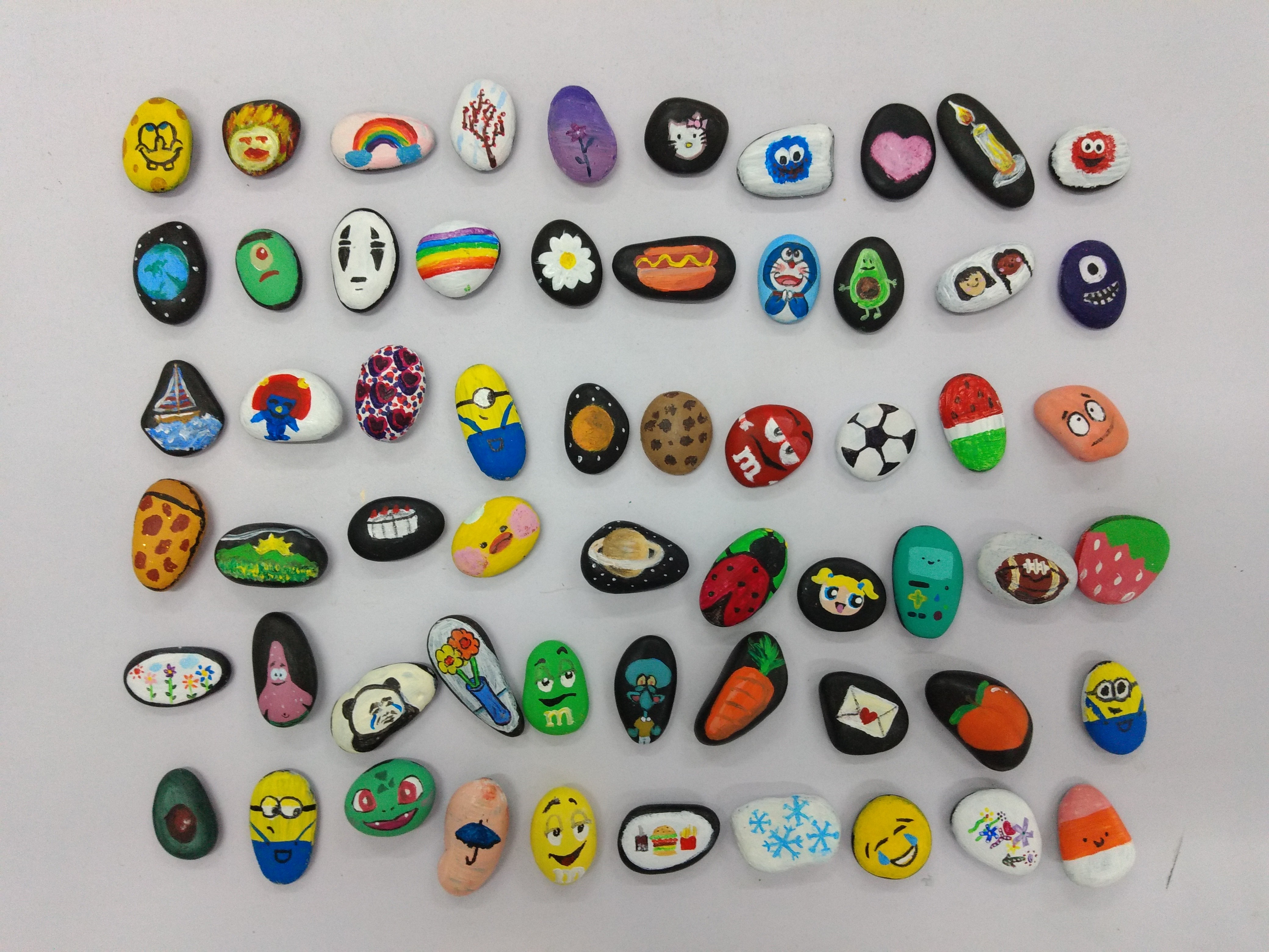
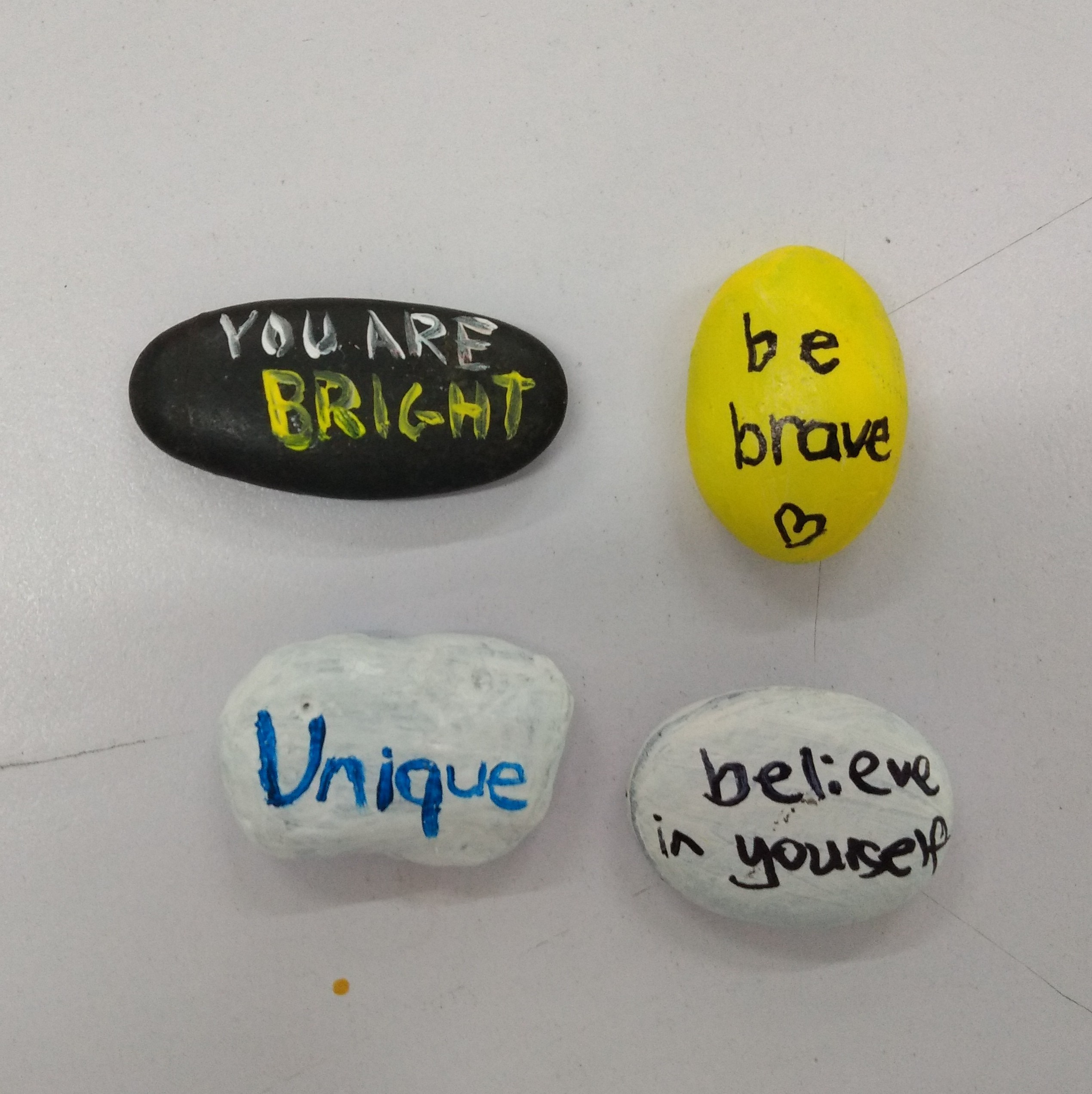
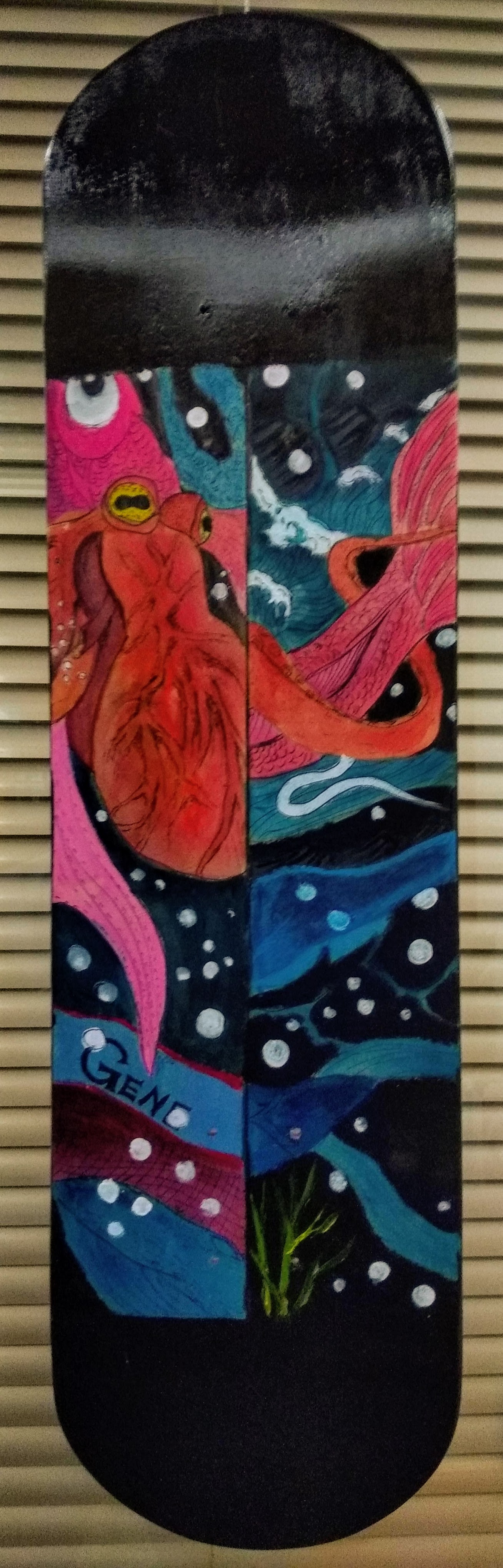
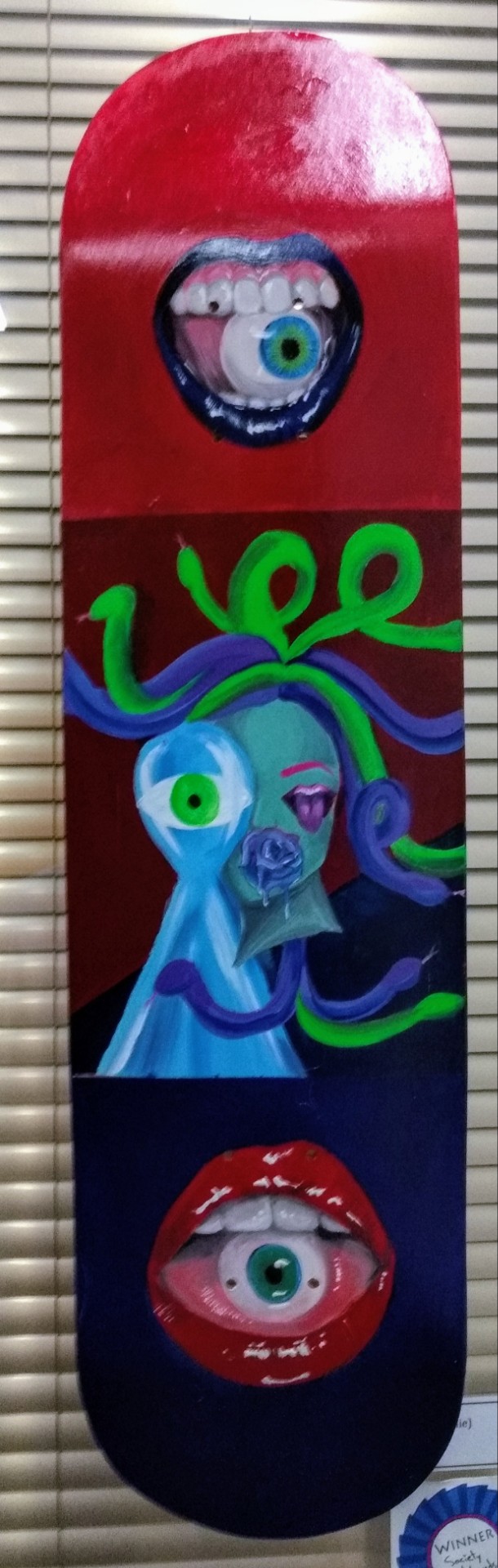
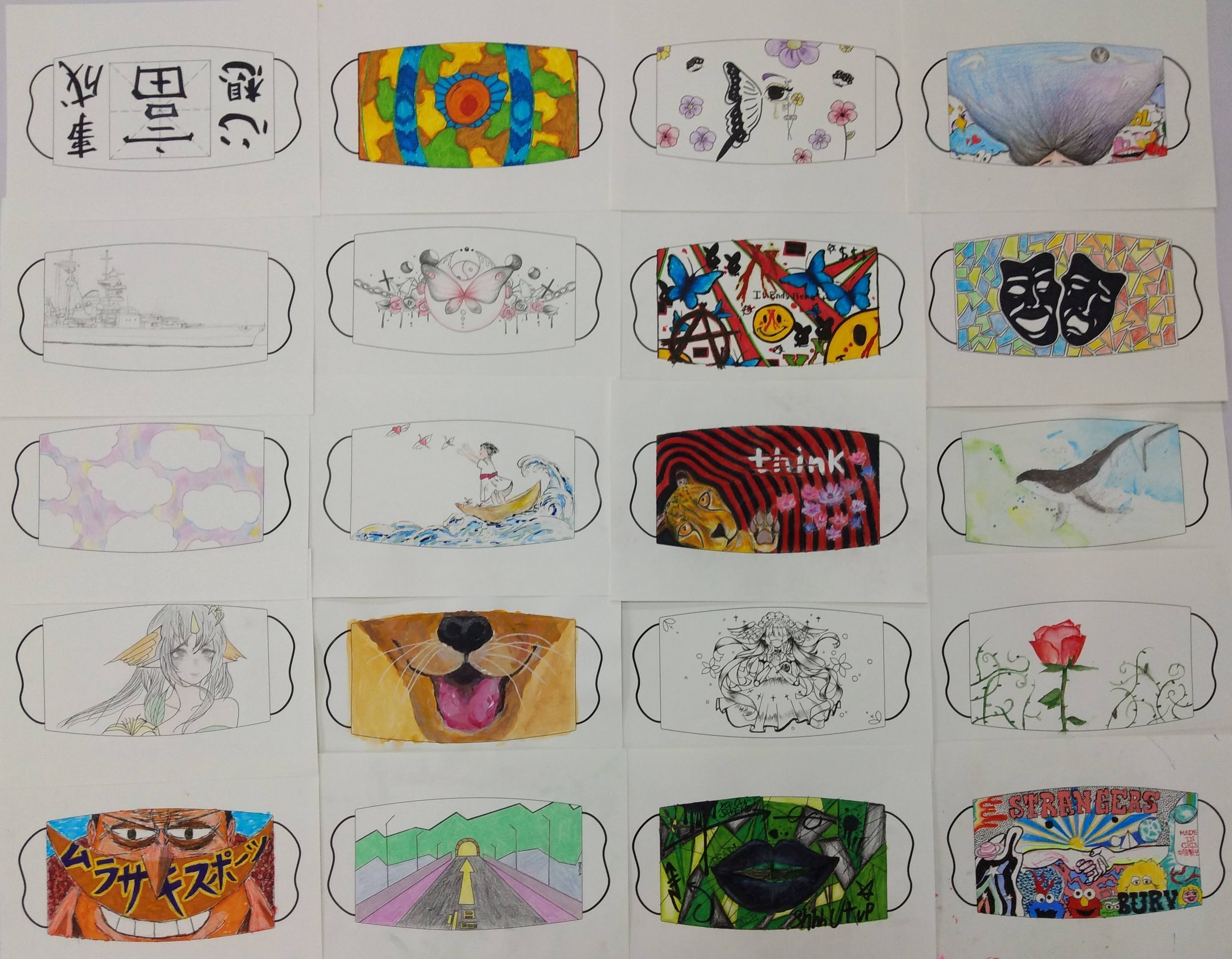
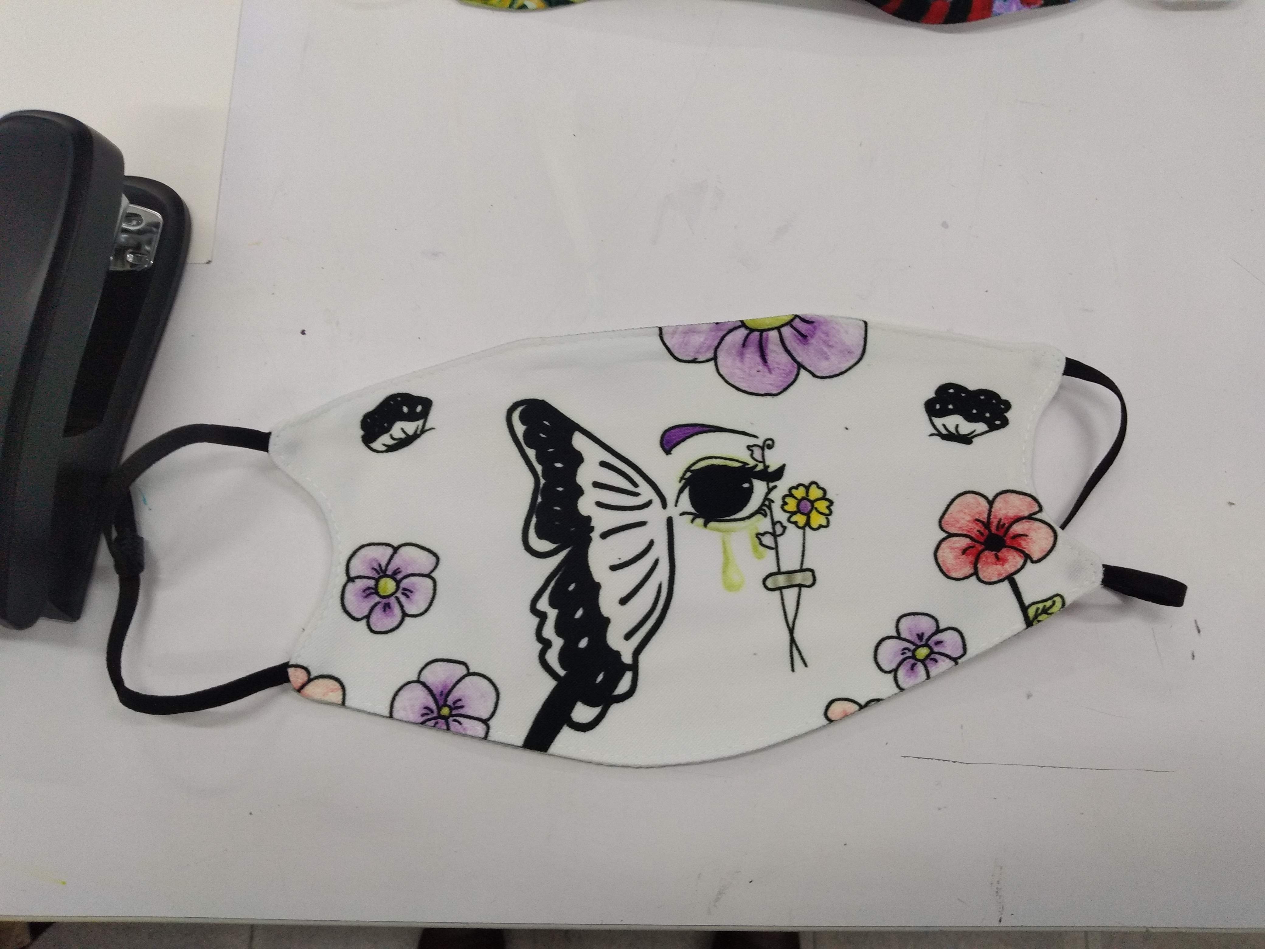
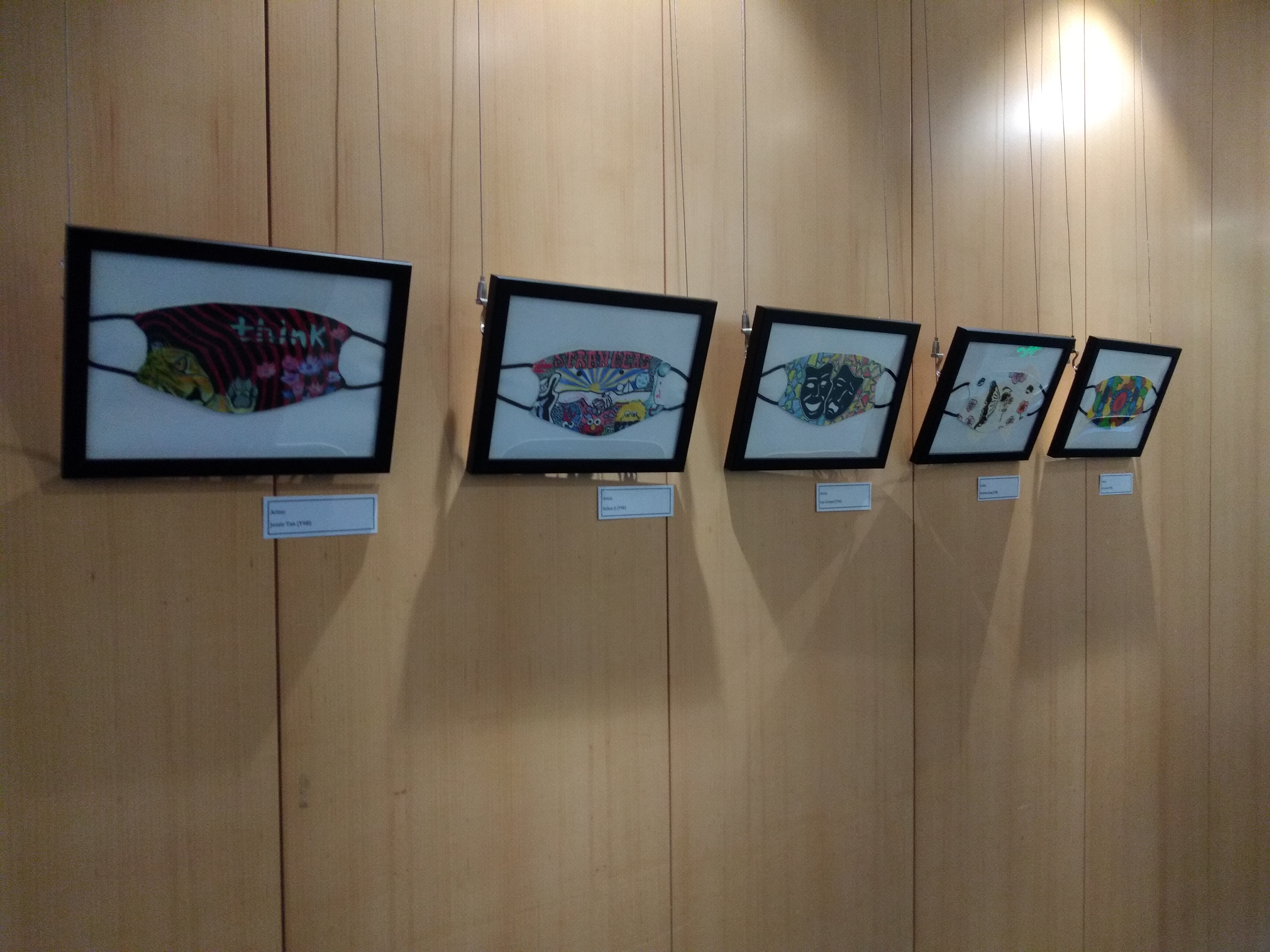
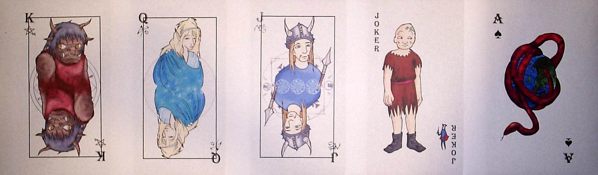
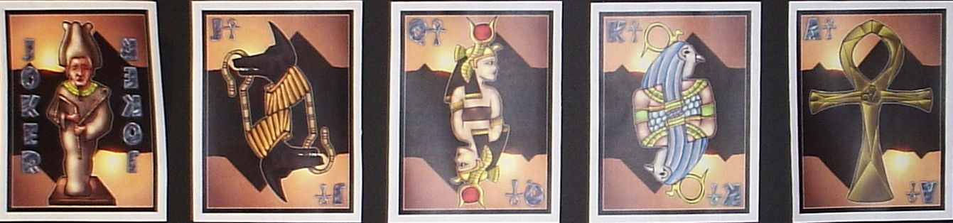
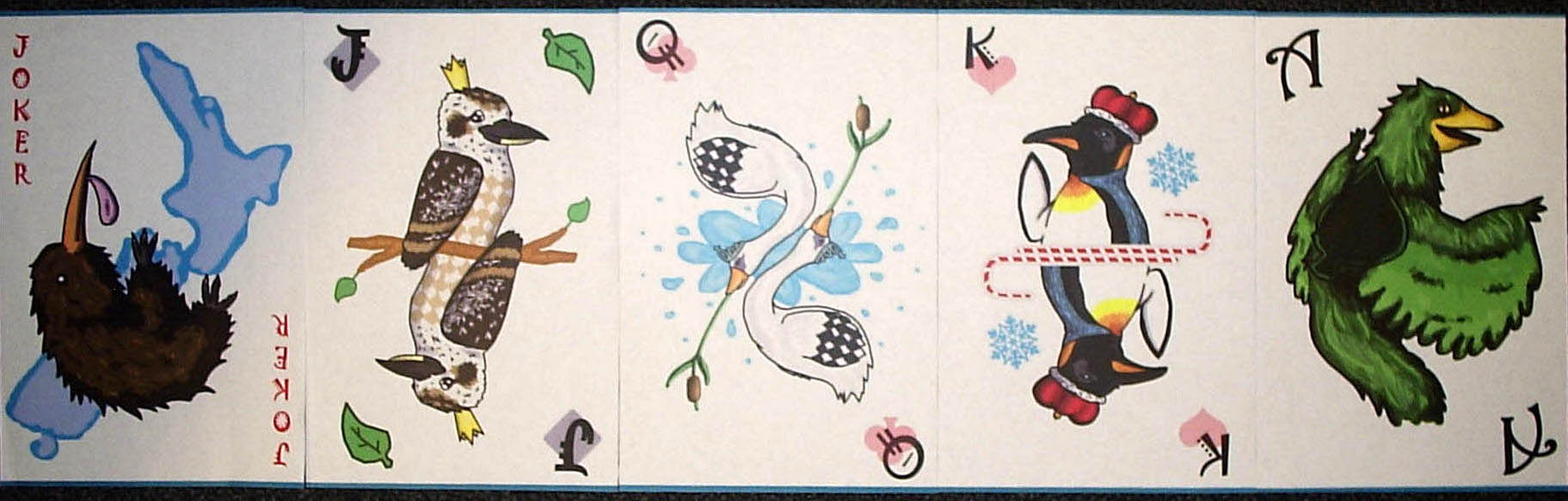
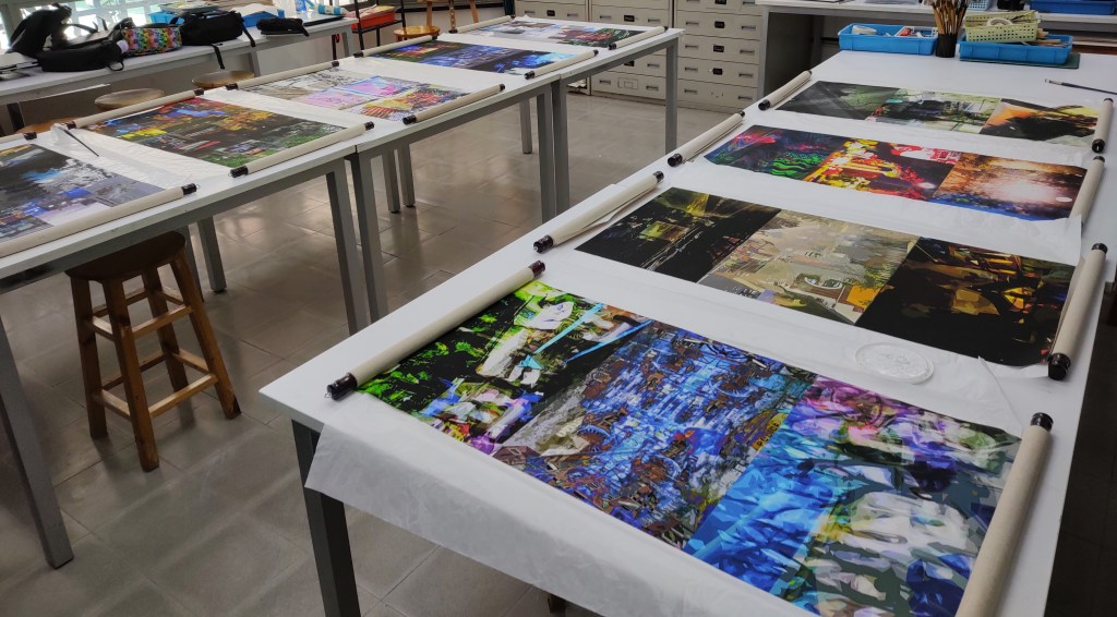
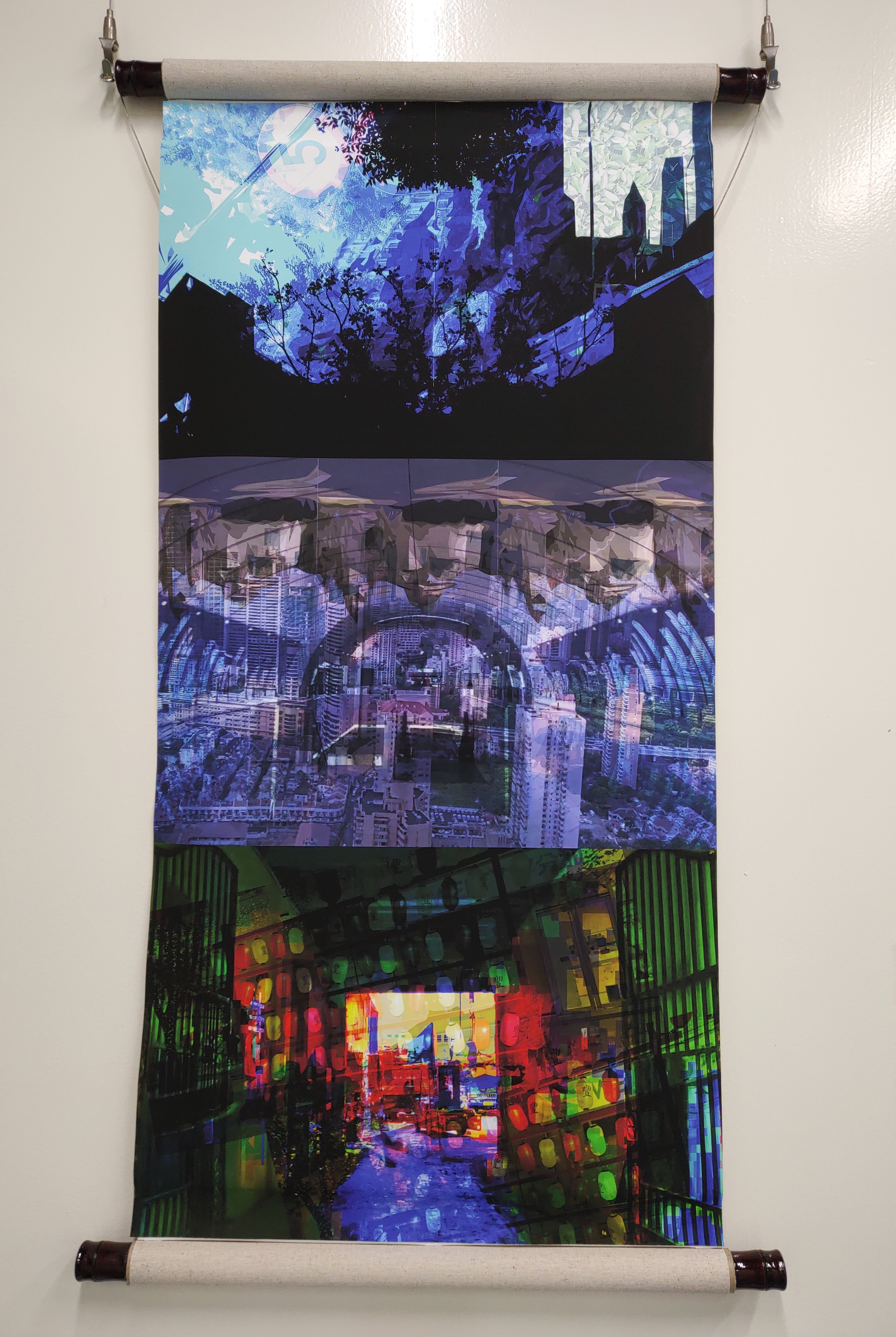
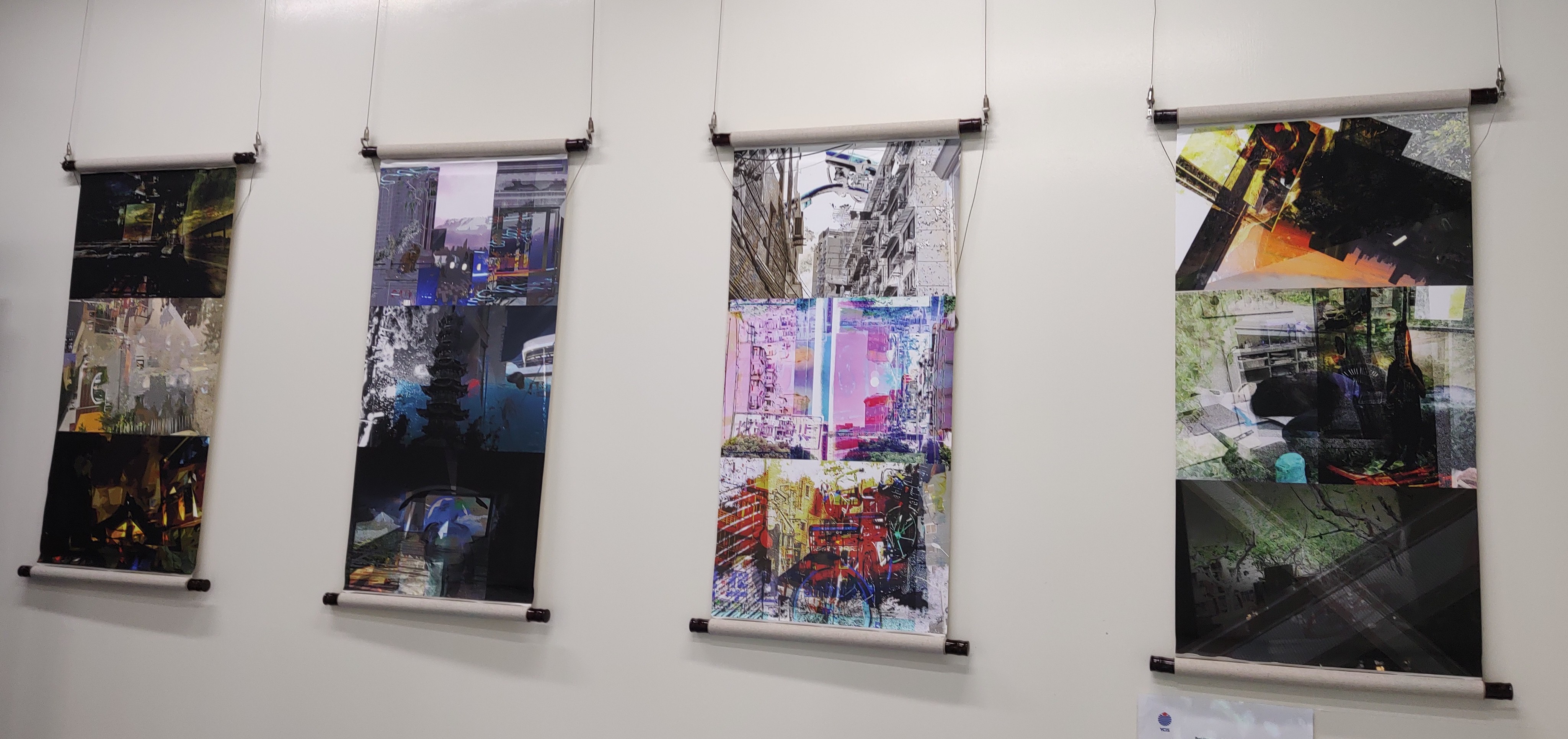
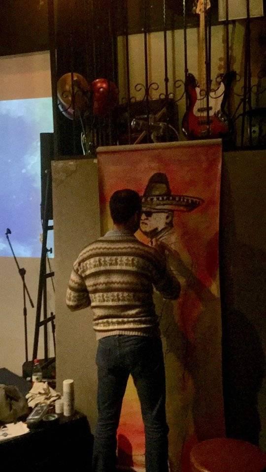
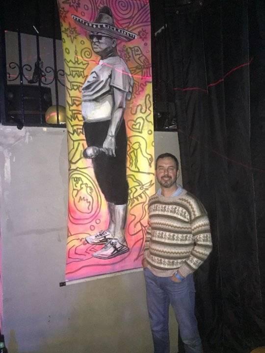
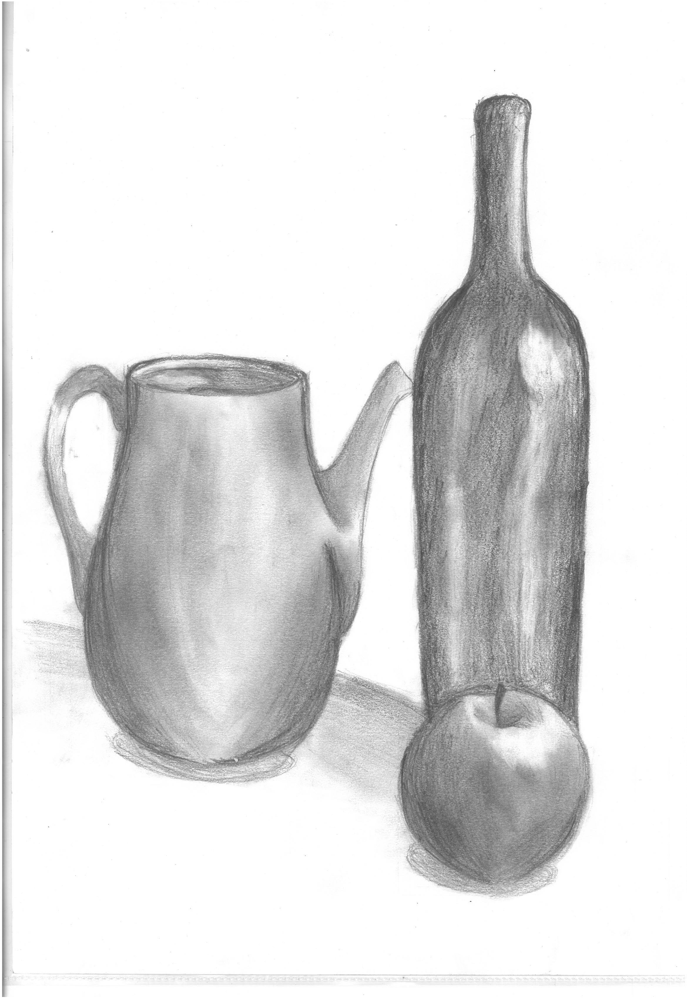
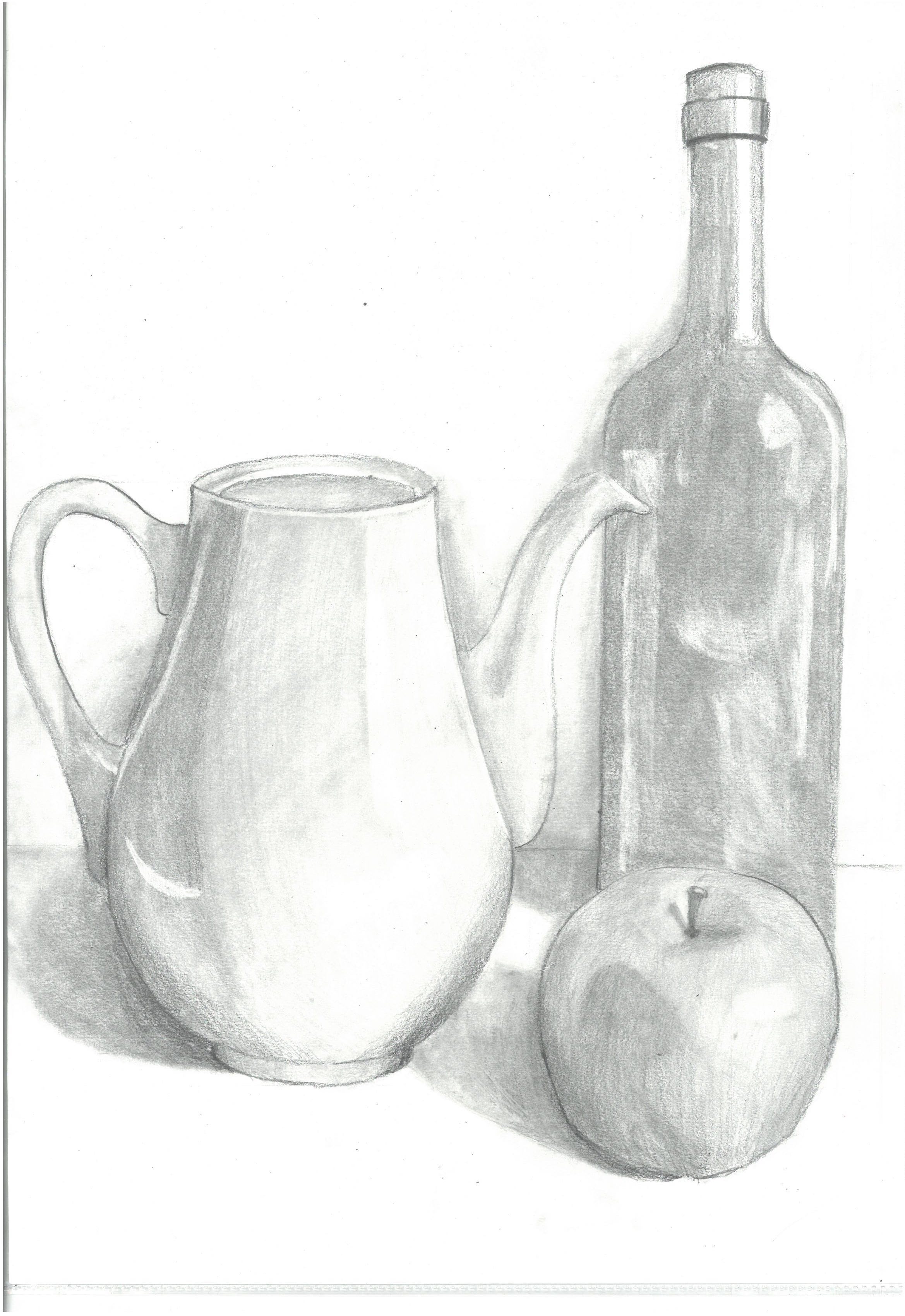
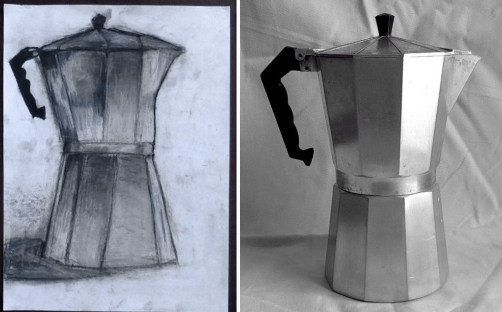
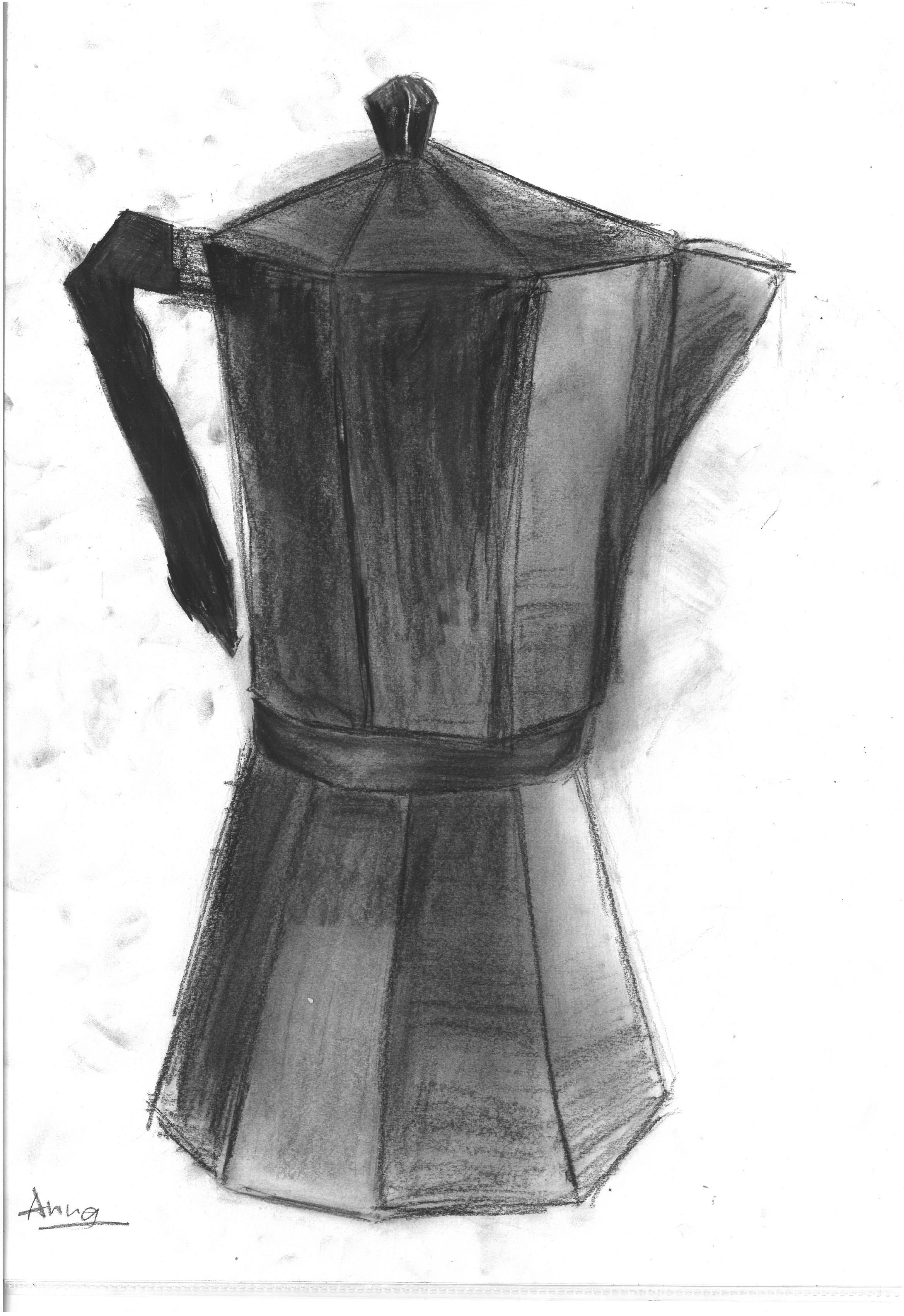
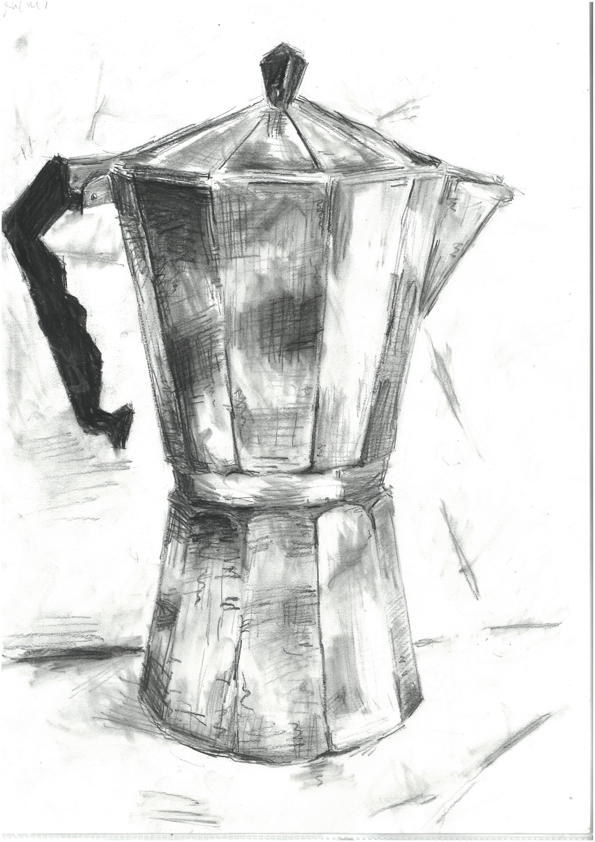
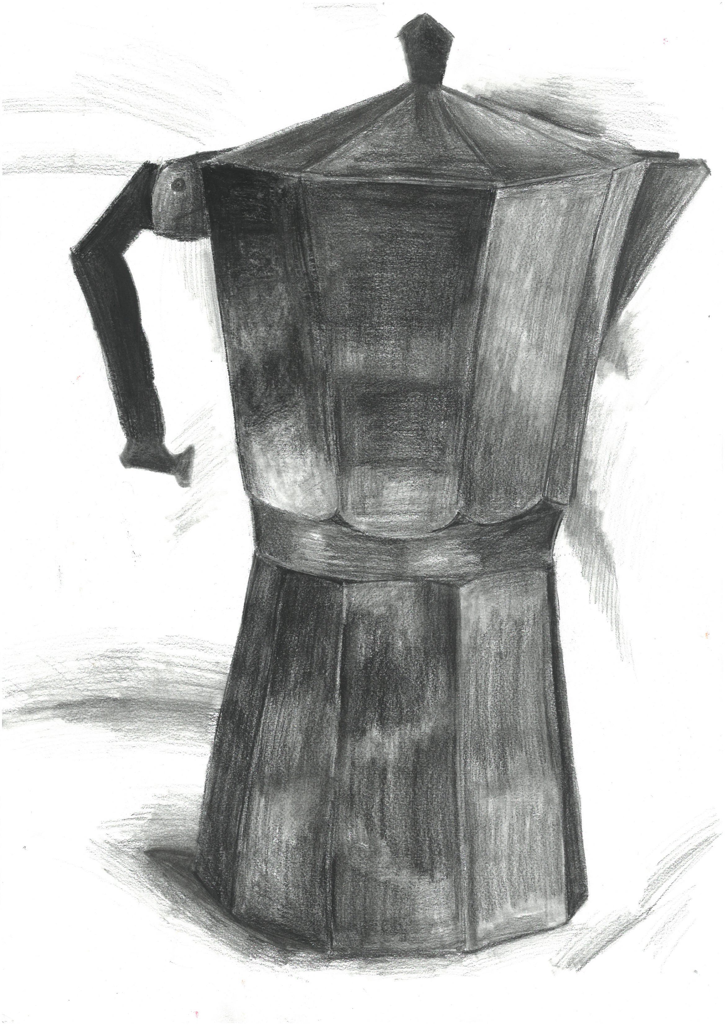
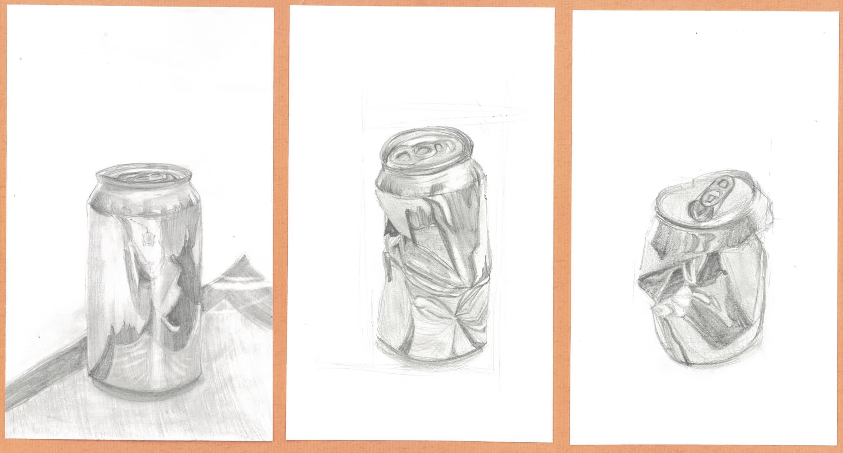
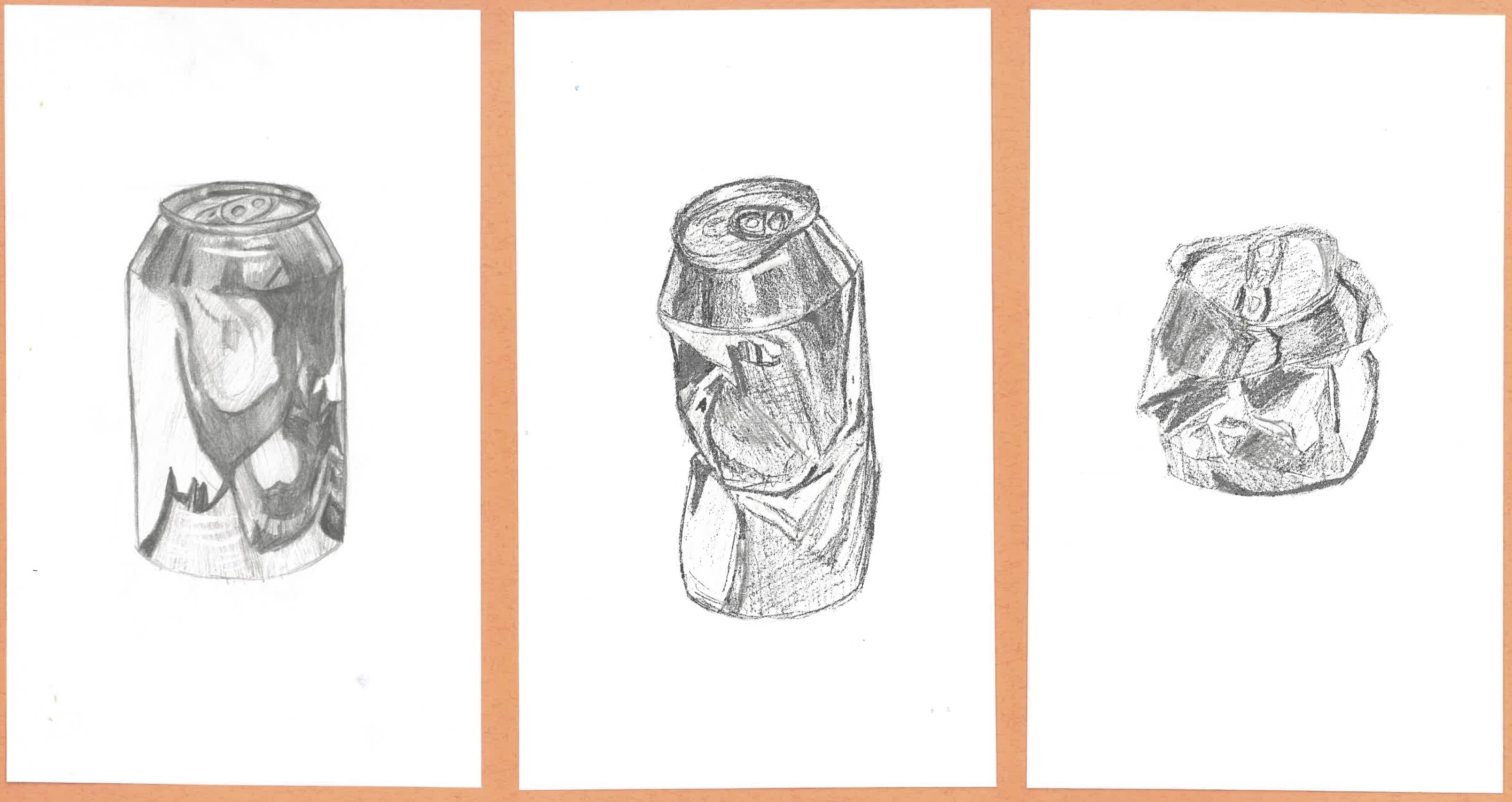
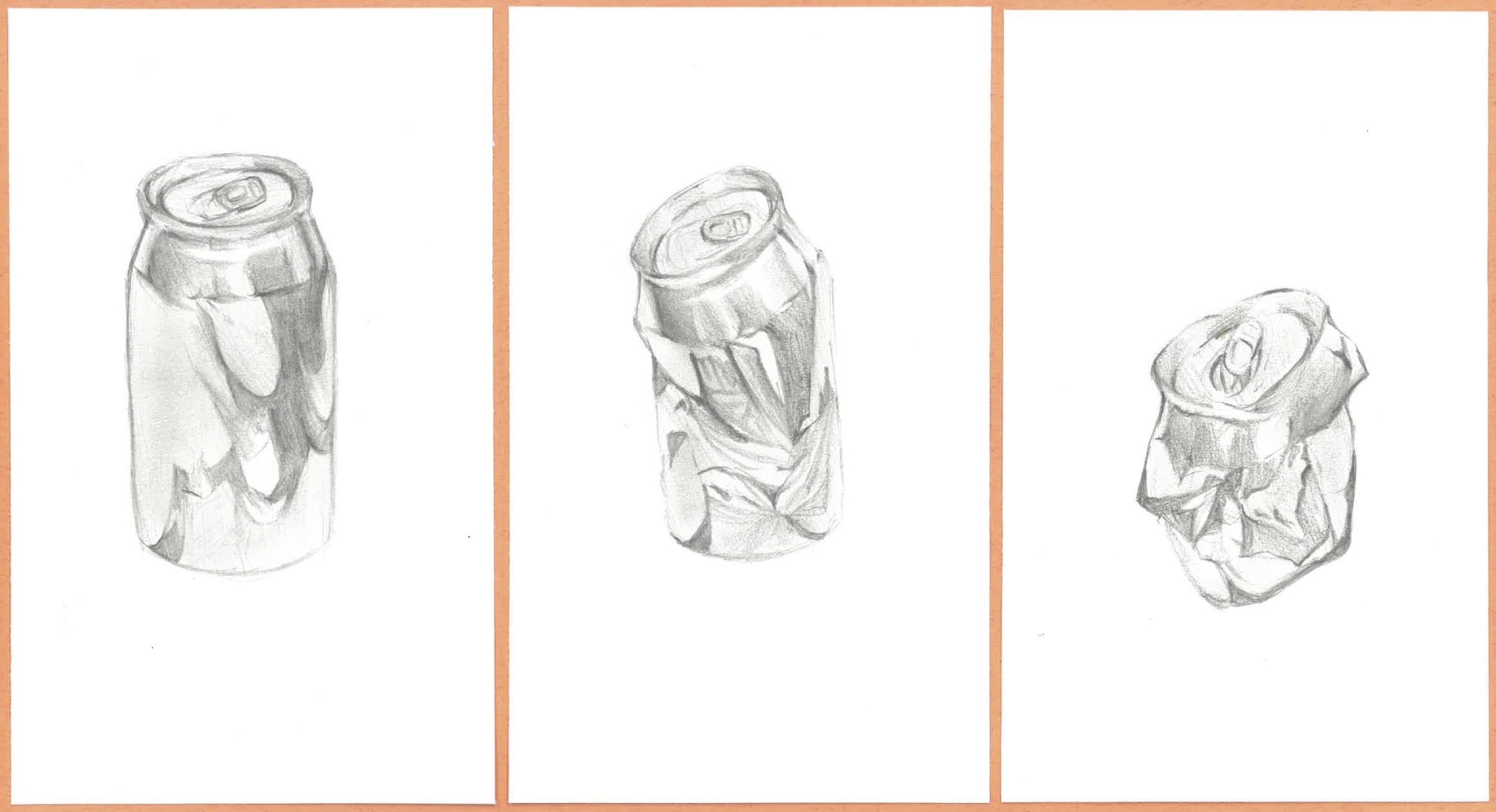
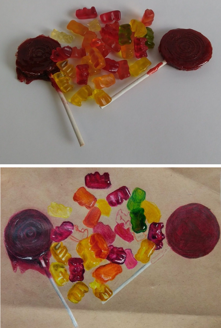
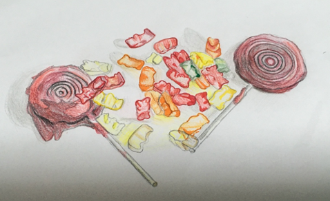
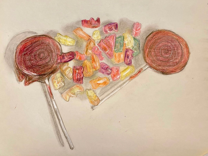
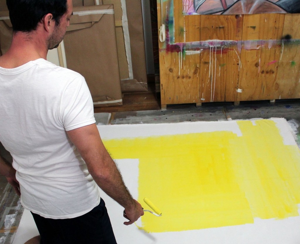
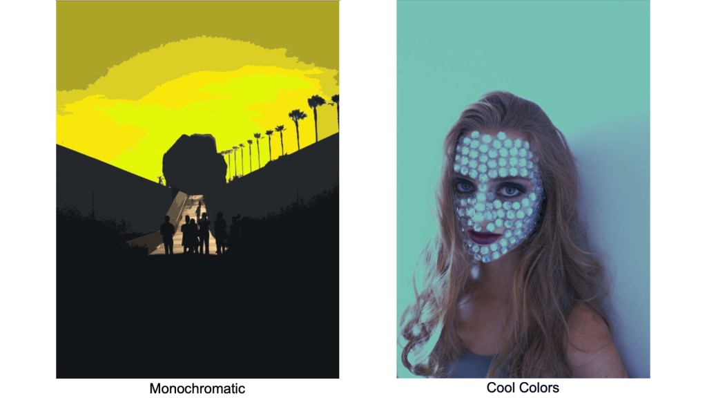
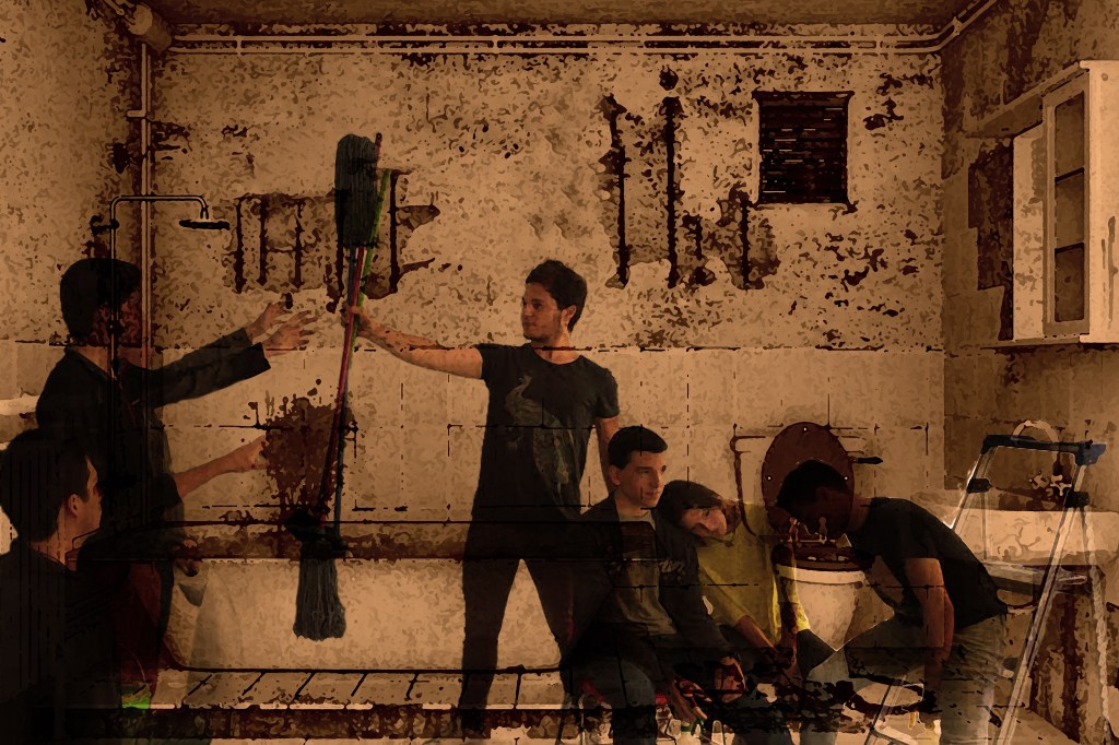
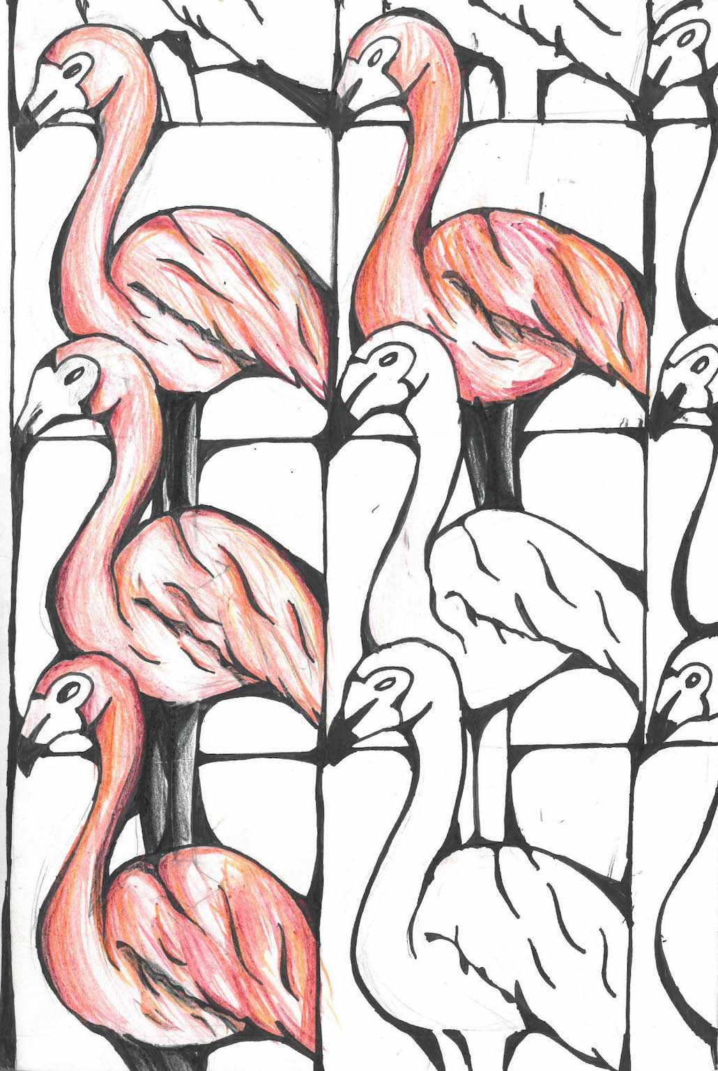
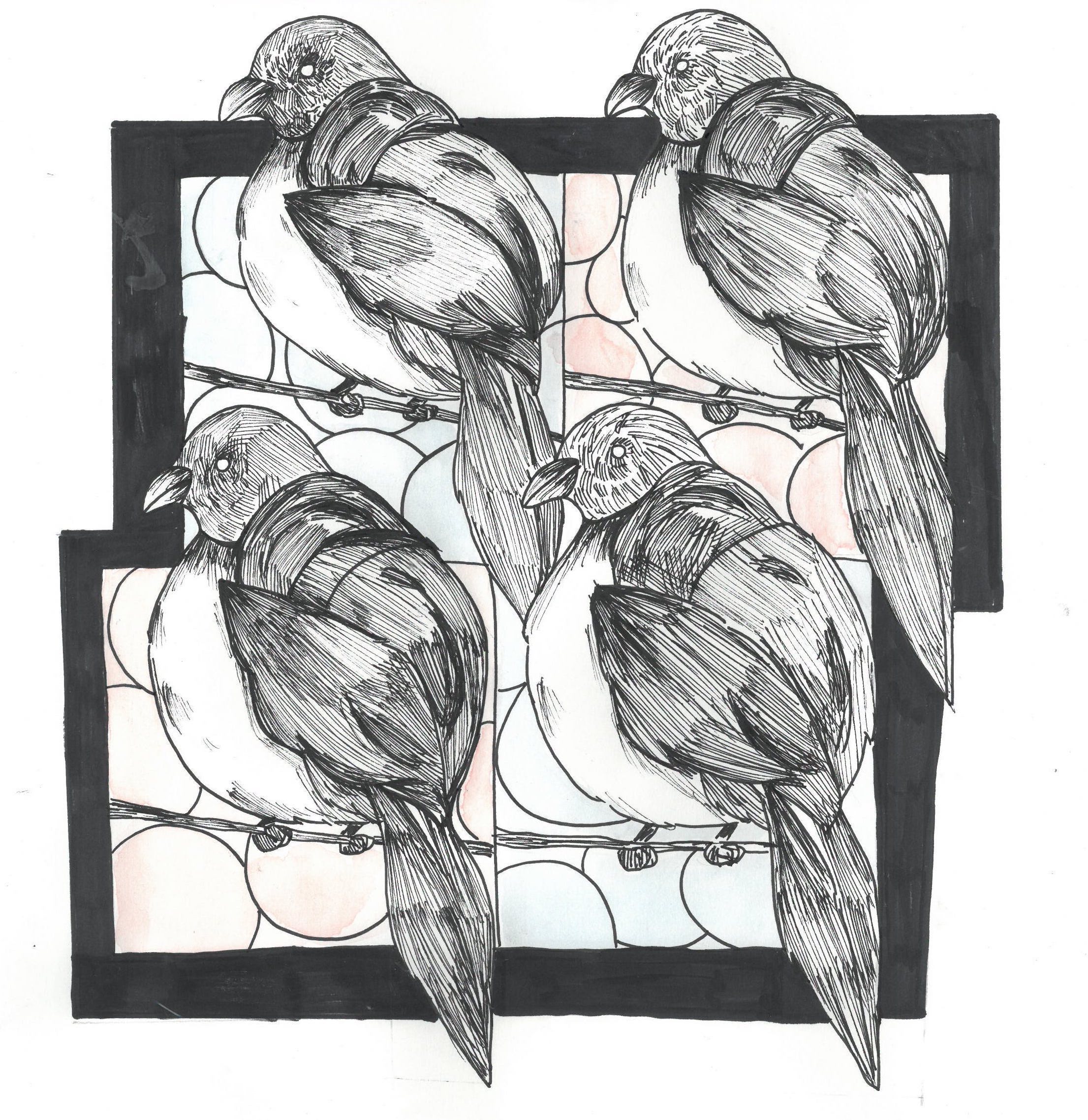
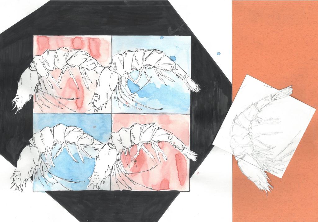
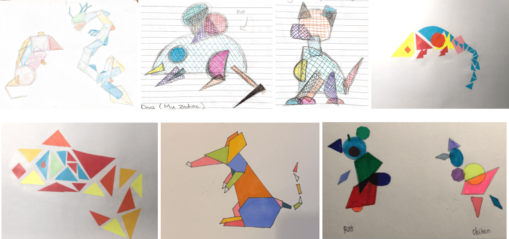
Here are some examples of student work.

Choose Kindness!

Character formation is a key role for educators and, with that in mind, kindness is something that’s become a buzz word in my classroom. The quote made famous by the movie Wonder “When given the choice between being right or being kind, choose kindness” (Dr. Wayne Dyer) is posted in my room along with things like the Color Wheel and IB assessment criteria. My students know that I’m into seeing them be kind to each other. I bring it up all the time and compliment students publicly when I see acts of kindness. I even hear students say “hey, choose kindness!” to each other sometimes when they want to change what someone is doing.

Kindness stones have been around for a long time, and I’m taking no credit for inventing them. While I wouldn’t make an art unit with kindness stones. They’re a great project to have during summer camp or to keep students busy when they finish a project early. If you’ve never heard of them before, it’s a pretty simple concept. Paint a beautiful image onto a rock, write something nice on the other side. Then go put it somewhere where a stranger will find it and hopefully it will brighten their day. The idea of painting something on a rock, writing kind words on the other side, and then hiding it for someone else to find is so beautifully selfless in its nature.

I recommend buying nice smooth, flat rocks from a landscaping business and keeping a small space to paint kindness stones in the room if you can spare it…or just keep the materials in a bin. Use acrylic paint and consider putting a clear water-based varnish when finished (like Mod Podge). At my school, the students hid the stones around the kindergarten for youngsters to find.

The photos show some kindness stones, the messages on the reverse side, and placing one next to a plant outside.

Recreating Well Known Objects

One common theme in my art projects is the idea that artists recreate, over and over again, objects we all know and love. Arguably, this is more effective than making paintings, as it turns an idea on its head. When you stand in front of a painting, you’re expecting to see a painting. Obviously, it has to be done well. But if a student has recreated a skateboard, playing card, covid mask, soap dispenser, or scroll, it involves an element of surprise and surprise often comes with the emotion of joy. Once you go down this path, you often start seeing objects as art pieces all over the place. It’s a legitimate paradigm shift. There’s also an aspect of problem solving in this, which is essential to great art lessons. Art classes should teach students to be great problem solvers, after all. Below are some examples.

Skateboards created by some IB art students.

Covid masks with year 9 students. They were printed and given to the students, some of the best ones were displayed in frames.

Soap dispensers with year 10 students. Just buy the pumps, trim the straws, and epoxy them to the ceramic piece when finished!

Playing Cards with year 10 students. Hand drawn, scanned, duplicated and flipped, then colored using Photoshop.

Scrolls with IB art students (this could also be a great AP 2D project). I posted this before but it fits them theme, so here it is again.

These kites were painted by year 7 students. It was a study of Henri Matisse and looking for ways to express school virtues through symbolism.

My own work in an exhibition of art on Frisbees. I haven’t investigated how to do this yet with my students, but I thought I should include it as it fits the blog post.

Abstract Scrolls (Contemporary Codex)

Those who know me, know I’m a real geek for color and composition, and that I love finding ways to use technology to produce great art pieces with my students. The scrolls I made with my IB class are one of those art units that evolved over time improving to what is now this project. The idea came from a night where I was making an art piece live in front of an audience at an event in Shanghai. It was an image of a man in a sombrero showing off the infamous “Beijing Bikini”…a Chinese tradition of rolling up one’s shirt to let off some steam in the summer months. I attached the piece to two scroll handles to add some irony. Since then, I’ve been looking for a way to bring the scrolls into my teaching in a less cheeky way.

There’s a lot that goes into an art unit like this. Separate lessons on advanced use of color and composition with vocabulary tests that follow. Some basic lessons with Photoshop. A photoshoot to gather original source material for the artwork. Then finding a vendor to print the work on canvas. The last step is to see if they can analyse the work effectively in a process portfolio screen.

There’s a beautiful connection to art history in this one. All the photos that students use are of the city. They’re fragmented abstract landscapes of Shanghai. I see them as a contemporary interpretation of the ancient landscape scroll paintings on display in the national art museum. More importantly, the students start to build a more intuitive relationship with art making and the forces that drive the visual language (hence the codex reference). They know that I want them to disassemble the imagery into completely non-objective abstraction, I’ll often hear students turn from their computers and ask “Is this one crazy enough yet Mr. Schell?”.

Below are pictures of the results and some pics of my night painting the Beijing bikini man live.

The Role of Still Life (and different levels of difficulty)

Photos of a crazy still life my art teacher friend tortures his students with.

Drawing or painting a still life spans the history of art itself (as far back as the Roman, perhaps further still)…and I think it was best summarized by Van Gogh painting his boots. When you’ve literally got nothing left to paint, just grab the stuff around you, organize it, and get to work on an art piece of it. Admittedly, still life art is uninspiring to me, but students really resonated with it around middle school when they start wanting to see how well they can make artwork that looks like reality. So even though they aren’t my favorite assignments, I get it and understand their importance both developmentally and historically. Doing one still life each year until my students are in IB or AP art makes sense to me.

I have an art teacher friend who sets up maddeningly complicated still lifes for his students (pictured above). They look more like Rube Goldberg machines. And what’s up with the hand on the mannequin’s head?! I keep mine simple relying more on what the individual objects convey and can teach us. Call it a “you could do this at home” approach to still life. I also think it’s a great activity for online learning and am not opposed to students drawing a photo of a still life on a screen. Most artists from the renaissance onward were using projectors anyway.

Here are some examples organized by year level and difficulty with brief explanations. I’ve attached my photos below that you’re welcome to nab for a still life.

6th Grade Still Life. Very simple with an emphasis on the different tones of a white object (the teapot) and dark object (the bottle). I love the first student example for its expressive mark-making in charcoal. The four pencil drawings below are A3/tabloid size.

7th Grade Still Life (Coffee Maker). This object allows students to study a range of tones as each panel of the coffee maker reflects the light a little differently. I like doing this one in charcoal. The drawings are A3/tabloid size.

8th Grade Still Life (Metal Can Triptych). This one is starting to get difficult and when the can is getting crushed and the light starts reflecting in very random ways it becomes a right brain activity because you literally have to draw what you see not what you think a can should look like. I’ve always thought the middle can was the most difficult but the students in this example really struggled with the last one.

9th Grade Still Life (Shiny Candy). Though simple looking, this one is really hard! If my students can draw shiny candy well, they can draw almost anything (water, glossy makeup, car paint, etc.). And when the gummy bears get mixed into a pile it becomes a right brain activity again. You have to draw what you see (little undulations of reflective color), not what you think a gummy bear looks like.

Here are some if my still life photos. Feel free to use them in your lessons.

Large Leaves
Shiny Candy
Metal Cans
Reflective Objects in a Drawer
White Teapot Still Life (Black and White Version)
Fake Fruit with Blue Sponge for Contrast
Coffee Maker
Violin (a classis art image)

X-Ray Vision (Computer Art Project)

Sometimes you create an art project that is so simple in its nature, yet the results are great…like this one. Maybe it’s because teens seem to like gory stuff? Regardless, my x-ray vision project has a really simple basis: Using images of bones and/or organs and the opacity function on Photoshop layers, show the model’s inner beauty. It’s a great way to teach when it is actually OK to nab pictures from the internet for one’s artwork (I’ll include a slide from one of my presentations about that subject below). It also reinforces using classmates/friends/even faculty as models. Moreover, it’s one of those art assignment where the student doesn’t have to be great at traditional art making practices to create the work. Although I’ve never done this before, I think these computer art pieces could be great sketches for a drawing or painting.

A screen about getting images from the internet
The opacity and layer effects are useful for cleanly integrating the bones and the “x-ray effect”.

Beyond the Color Wheel

Think about color for a few minutes.

James Turrell, Mark Rothko, Claude Monet, Henri Matisse….so many of the titans of the art world are who they are because of color. Mike Tyson famously said “everyone has a plan until they get punched in the mouth” and color is what often gives artwork its punch.

So what do you teach students after they know the basics of the color wheel? Students learn primary, secondary, tertiary, and complimentary colors, but what’s next? Here are some of the many things I like to teach my students about color. The list gets into things that students may already see on their phone apps (like Instagram filters) but didn’t have a vocabulary for. If there are other terms that you like to teach your students, please share them with me!

Saturation refers to colors that are more vibrant than they appear in real life.

Muted color refers to colors that are duller than they appear in real life.

Analogous colors are colors that share one color in common.

Monochromatic colors refer to different tones of the same color.

Warm and cool color palettes change the emotional response of the viewer.

There are different kinds of black and different kinds of white (usually determined by materials). For example, black compressed charcoal will absorb more light than black oil paint.

The color red warps the mind. It has the strongest effect on us psychologically.

The difference between printed and projected color (RGB vs CMYK).

Color distribution (when you use a color in one are of a piece, consider adding a little bit of the same color somewhere else).

Contrasting colors versus harmonious colors.

And my favorite. Tetrachromacy refers to a chromosomal anomaly in some women allowing them to see thousands of colors that are invisible to the general public.

Below are a few images from my slide show on color including my definitions.

Creating a Neo-Classical Masterpiece (Jacques Louis David)

One big challenge for art teachers is getting students to make artwork without using online imagery. While there are occasions where online imagery is necessary (like when you need a photo of something you really can’t take yourself [you’re painting a humpback whale or whatever]), for the most part you want students to not use the internet for that. It’s hard too, as the internet provides an easy way to browse thousands of images…but ultimately it lacks originality on some level.

This assignment helps emphasize how useful your classmates are as models (obviously clothed). It reminds me of a “tableau vivant”. The project is to recreate a Jacque Louis David painting using your classmates, objects around the school and Photoshop. Admittedly, I thought most students would go for “The Death of Marat” as it requires only one model. But that wasn’t the case in my classes (although I got some really creative Marats too!).

The project can nicely tick a lot of boxes related to art history, teaching composition, using models and props, and generally thinking out of the box. I also like the idea of reinventing known things in new and interesting ways.

Here are some examples. I would be remiss not to mention that despite being famous for the Mona Lisa, the painting wing with David and Gericault in the Louvre is probably the most impressive area of the museum.

Death of Socrates
Oath of the Horatii
The Death of Socrates
Oath of the Horatii
The Death of Marat
The Death of Marat
The Death of Marat

Having fun with Tessellations!

Tessellations get a bad rap sometimes and I’m not sure why. Maybe the repetition comes across as unartistic or too predictable? Perhaps art teachers don’t realize how easy they are to plan? Regardless, once you get going, sky’s the limit. There are so many wonderful things you can do with tessellations and pattern is one of the major art elements that often gets overlooked by teachers.

Tessellations are a great way to collaborate with math classes and sharpening hand-eye coordination. They’re also a cool activity if your art room isn’t very large or you’re doing online learning. The difficulty level can be adjusted for the age group you teach too. I base my tessellation unit on M.C. Escher (of course!) and focus on his art piece “Sky and Water”. It gives the unit some boundaries as students choose either a sea or sky animal to tessellate. I’ve done tessellations a few different ways over the years. Here’s an overview of the basics.

Cut a lot of 3x3in (7.6×7.6cm) squares.

Look up a realistic photo online of a sea or sky animal for reference.

Tape 3 squares together, the animal’s head and tail should exit to top and bottom of the square (see the example photos) but not overlap each other when tessellated.

Cut out the top and bottom paper squares so that you only have the head and tail. The body should remain in the middle square.

Trace them creating a 4 or 6 tile tessellation.

Draw the body of the animal, it can be different in each tessellation but should be relatively similar. You could also cut out the animal completely after you make the tessellations for a full outline, but I prefer including some freehand drawing.

After that, it’s up to you what to do. They could be colored, accented with illustration pens or painted on.

Getting started with a sturgeon fish tessellation.

A bird example and the continuation of the sturgeon tessellation.

MC Escher: Sky and Water, 1938 and an investigation sheet from a year 8 student.

Three student examples from different years. One with colored pencil, the other two with illustration pen and watercolor.

Matisse Cut Outs: Teaching Abstract Art

One of my all time favorite art pieces is the cut out “Icarus” by Matisse. Brilliant in its simplicity. The black figure of Icarus could be any of us, and is he falling or floating? The blue looks more like water than sky to me. The piece bridges life and death, and like most of Matisse’s cut-outs makes more sense after reading the title. Framed by stars (or are they explosions, the piece could be a commentary on World War 2), it’s the standout from his ground-breaking book Jazz. And what makes an art piece like this so powerful is the deep message hiding behind a rather simple abstract image. The simplicity is also what makes this a great art lesson as it can easily be taught online or in the classroom.

Matisse was an artist I learned to love later in life, it seemed to go hand in hand with when I started painting street art. I think the brightly colored spray paint had so many connections with his bold use of color. Now his work is something that stops me in my path when I stroll museums. There is area in the MOMA with many of his works, most notably “The Piano Lesson”, another brilliant piece. I’ve included a picture of me there in front of a different painting.

Standing in the MOMA checking out one of the many art pieces by Henri Matisse in the collection.

There is a great video or two by the BBC on Matisse starring art critic Alastair Sooke (I’m a huge fan and think his videos are a great resource for children ages 13 and up). I show my students a brilliant section on Matisse’s book Jazz that’s a segment from Sooke’s program “Matisse: A Cut Above the Rest” (minutes 5:24-9:00).

Alastair Sooke talking about Icarus in Matisse’s book Jazz.

Here’s how I use Matisse’s cut-outs as a framework for making abstract art. We look at his art piece “The Snail” and discuss how it does and doesn’t look like an actual snail. I have the student watch the video previously mentioned and then complete an investigation on Matisse using their computers to research the answers. We then start transforming the animals from the Chinese zodiac into Matisse inspired abstractions. Students search realistic photos of the animals and use those as a basis to make shapes that could be the animal. I originally taught this project in Shanghai so the Chinese zodiac made sense as a reference, but you could do anything. I would stick to animals, and doing many of them, because it’s in the repetition where one starts to get better with abstraction. You can (and should) make these out of paper cut outs, as it will make the work even more abstract. But since I did this teaching online, we used whatever was available. This was taught to 7th and 8th graders, but like many art projects, could be adapted to suit other ages. I recommend doing a basic color lesson beforehand.

Examples
Example Investigation