I’m a big fan of using technology to level the playing field in art class. Many students can think like an artist but may not have the skillset (yet) to draw or paint with precision. This unit hits all sorts of categories that make a great lesson: Art History, Typography, Photography, Composition, Color, Photoshop, to name a few. The result are often great and can be additions to an AP 2D Art Portfolio or an IGCSE A2 Board, not to mention a great Process Portfolio page or two for IB Art.
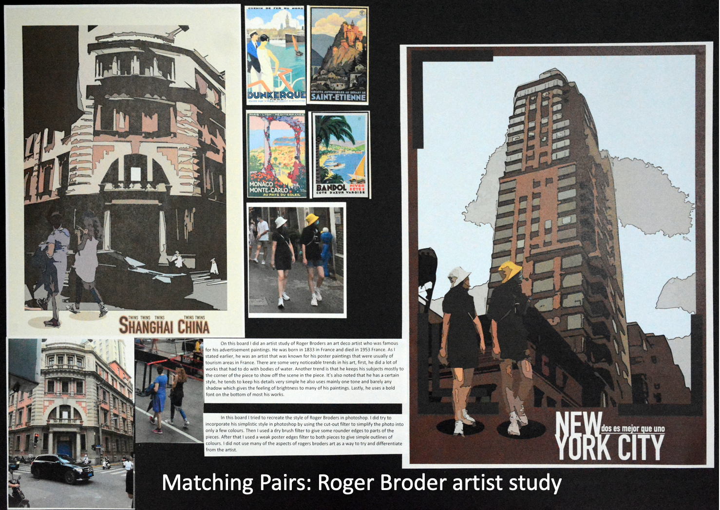
The basis is simple. Using a great photograph or two from vacation, make a poster in the style of Art Deco. I recommend studying Roger Broders for this project. The photos can be reduced to something simple like Art Deco using a few Photoshop functions: the cutout filter, poster edges filter, and the image saturation (to enhance the color). Students should also download an Art Deco font (free online).
If you live in a city, like I do right now, there is the added bonus that there are probably some Art Deco buildings around for students to see. This is a great reference to how what we learn can improve the quality of our life. I personally enjoy taking note of this aesthetic style while riding my bike around the city and passing Art Deco buildings.
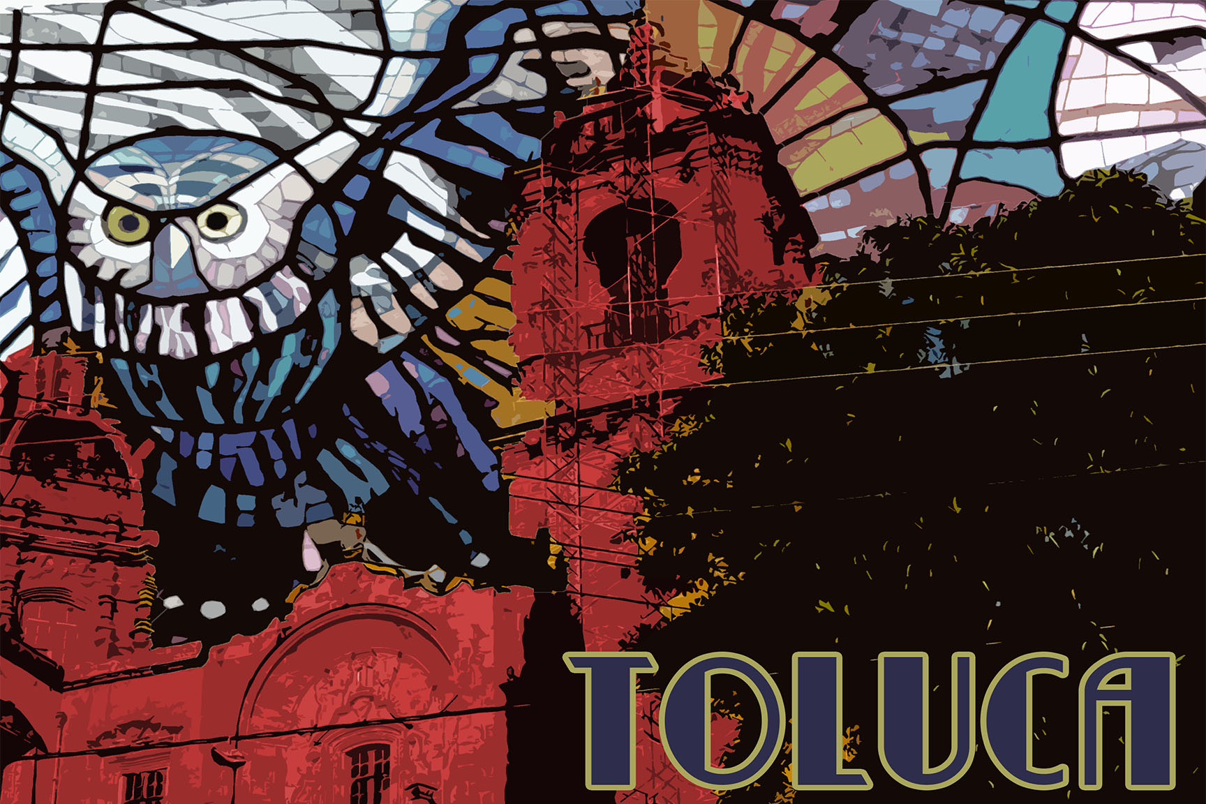
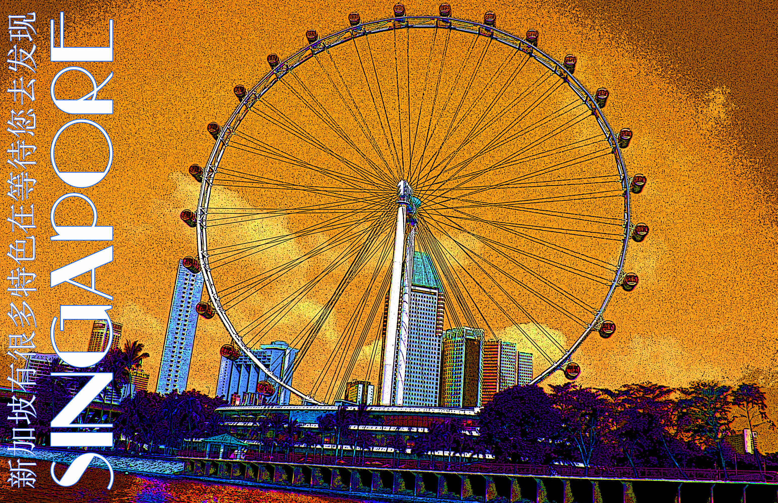
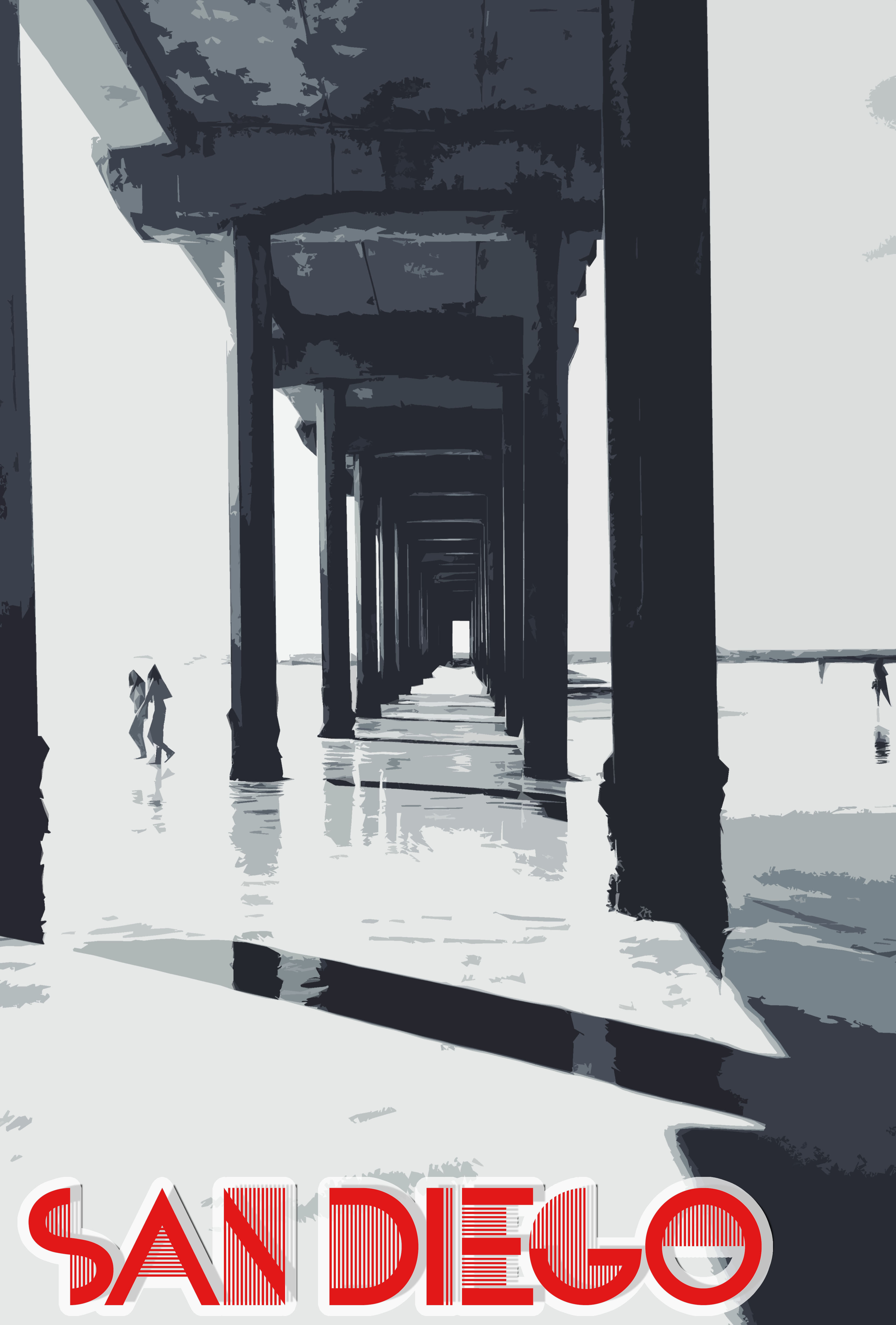
Here are a few examples from AP 2D and IGCSE portfolio boards: